

I still remember the first time I saw a complex ecommerce site flawlessly reshape itself from my wide desktop screen down to my little iPhone. It wasn't magic; it was responsive web design.
In simple terms, a responsive website is like a fluid that perfectly fills any container. It automatically adjusts its layout—text, images, and navigation—to give every user the best possible experience, no matter what device they’re on.
My First Encounter with Responsive Web Design
This concept is now the absolute foundation of how our Melbourne agency builds high-converting Shopify and WordPress stores for our clients across Australia. Before responsive design came along, businesses often had to build a separate, clunky "mobile version" of their site. It was double the work and, honestly, the experience was usually terrible.
When I first started in this field, seeing a site elegantly adapt was a genuine game-changer. It meant one single website could serve every customer, whether they were browsing on a huge monitor at work or quickly checking a product on their phone while on the train.
This adaptability isn't a "nice-to-have" feature anymore; it's a core requirement for any serious ecommerce business. The shift to mobile browsing has been absolutely massive.
Responsive web design has become a non-negotiable in Australia, where mobile devices completely dominate how people use the internet. Recent data shows that over 75% of all web traffic in Australia now comes from mobile devices, highlighting just how critical a mobile-friendly site is.
The Australian mobile ecosystem is particularly dominated by iOS users, with over 60% of mobile users on Apple devices, while nearly 39% use Android. This fragmented device landscape makes responsive design essential for reaching everyone. You can dig deeper into these Australian web design statistics to see the full picture.
As a digital marketing agency in Melbourne, we see the direct impact of this every single day. A site that fails on mobile doesn't just lose a sale; it loses credibility and visibility on Google. This is why every Shopify development and WordPress design project we take on starts with a mobile-first philosophy.
Alpha Omega Digital is a marketing agency based in Melbourne, Australia but also services clients from Sydney, Brisbane, Newcastle, Perth, Adelaide, Darwin and Hobart. Have a project in mind? Contact us.
The Three Core Elements of Responsive Design
Responsive design isn’t a single switch you flip; it’s actually three clever techniques working together to create that seamless, fluid experience. When we build a Shopify or WordPress site, we're essentially teaching it how to be flexible and intelligent. These are the core building blocks we use to do it.
Think of these elements as the essential ingredients in a recipe. If you miss one, the whole thing just falls apart.
Fluid Grids: The Flexible Blueprint
First up, we have the fluid grid. Imagine building a house where the walls aren't measured in fixed metres but in percentages of the total floor space. If the floor plan shrinks, the rooms shrink proportionally. That’s exactly how a fluid grid works on a website.
Instead of telling a column to be exactly 400 pixels wide, we tell it to take up, say, 30% of the screen's width. On a big desktop monitor, that 30% might be 400 pixels. But on a small phone screen, that same 30% might only be 150 pixels. This simple shift in thinking prevents that awkward horizontal scrolling and ensures the layout always fits the space it's given.
Flexible Images and Media
Next, we need flexible images. For any online store, there’s nothing worse than seeing your beautiful product photos stretched, squashed, or cut off. Flexible images are coded to resize within their container—that fluid grid we just talked about.
We use a simple bit of CSS, something like max-width: 100%. This tells an image, "Never get bigger than the container you're in, but feel free to shrink down if needed." It’s a beautifully simple rule that ensures your high-quality product shots always look sharp without breaking the page layout.
This is how a single website design can adapt to serve users on desktops, tablets, and mobile phones.
The key takeaway here is that one central design serves every device. You don't need separate mobile and desktop websites anymore.
Media Queries: The Smart Director
Finally, there are media queries. This is the really clever bit of code that acts like a director on a film set. It checks the screen size of the device viewing the site and then applies a specific set of style rules based on what it finds.
A media query might say something like, "If the screen is less than 768 pixels wide, stack the product columns vertically instead of side-by-side, and turn the main navigation into a hamburger icon."
This is how a site can dramatically rearrange its content to become more usable on a smaller screen. To make sure typography scales perfectly across devices, tools like a REM Converter tool are invaluable for setting up consistent font sizes within these media queries.
How Responsive Design Directly Impacts Your Sales
So, let's connect the dots. Why does all this technical talk about fluid grids and flexible images actually matter for your bottom line? I’ve seen the answer play out time and time again with our e-commerce clients right here at our marketing agency in Melbourne.
Put simply, a responsive site creates a smooth, intuitive experience for your customers. When someone can browse, click, and buy without having to pinch, zoom, or fight with a clunky interface, they stick around. This is how you dramatically reduce those frustrating abandoned carts and keep shoppers engaged from homepage to checkout.
But the biggest win? Without a doubt, it's SEO. Google’s entire algorithm is now ‘mobile-first,’ meaning it gives massive preference to websites that work flawlessly on a phone.

A non-responsive site isn't just a bad look; it's a direct penalty to your search rankings. Better rankings mean more free, organic traffic finding your store. It’s a straightforward equation: a great mobile experience leads to higher rankings, which leads to more potential customers walking through your digital door.
Better Rankings and More Traffic
Ever since 2020, Google has completely shifted its focus to prioritise mobile compatibility. This makes responsive design one of the single most powerful levers you can pull for your search engine rankings. If your website isn't built to be responsive, you're effectively telling Google you don't care about mobile users—and it will rank you accordingly.
The consequences for Australian businesses are huge. A shocking 91% of small businesses still don’t have a mobile-optimised website, leaving a massive amount of revenue on the table. This is especially true when you consider that 75% of Australian consumers would much rather buy from a business that has a website. You can dig into more of the data in this report on responsive web design in Melbourne.
Simplified Workflow and Reduced Costs
Beyond the customer-facing benefits, responsive design makes your life so much easier. Instead of juggling a clunky, separate mobile site alongside your main desktop version, you get one intelligent website that works everywhere. This is a core principle behind all the WordPress and Shopify development work we do.
Managing a single responsive site saves you time, money, and avoids the technical headaches we see so often with outdated setups. You update your products, content, and promotions in one place, and the changes apply perfectly across every device.
This unified approach has a direct, positive impact on your operations.
- Cost Efficiency: You’re only paying for the design, development, and maintenance of one website, not trying to keep two (or more) in sync.
- Time Savings: Your team can stop wrestling with different versions of the same site and focus on what actually grows the business—marketing and sales.
- Future-Proofing: A single responsive site is far easier to adapt when new phones, tablets, or even smart TVs hit the market.
Ultimately, a responsive website isn't just a feature; it's the foundation of a modern e-commerce business. Think of it as an investment that pays for itself through better SEO, higher conversion rates, and a workflow that doesn’t drive you crazy.
Alpha Omega Digital is a marketing agency based in Melbourne, Australia but also services clients from Sydney, Brisbane, Newcastle, Perth, Adelaide, Darwin and Hobart. Have a project in mind? Contact us.
Implementing Responsive Design on Shopify and WordPress
As a marketing agency in Melbourne, most of the ecommerce clients we work with are on either Shopify or WordPress. The good news is that both platforms are built with responsiveness in mind. But here's the reality: the platform is just the tool. It's the execution—the actual design and development choices—that separates a clunky site from a high-converting one.
The key is understanding that a responsive theme is just the starting point. It’s where the real work begins.
Shopify Design and Development
Shopify has a fantastic ecosystem of themes, and virtually all modern ones from the Shopify Theme Store are responsive right out of the box. That’s a great head start. But when I'm vetting a theme for a client, I'm not just checking if it works on mobile; I'm looking at how it works.
Are the navigation menus intuitive? Can you easily tap the product filter options without zooming in? Is the checkout process completely seamless on a tiny screen? These are the details that make or break the user experience.
Sometimes, a theme's default mobile layout just doesn't cut it for a specific business need. This is where our Shopify development expertise comes in. We can build custom Shopify apps or dig into the theme code to solve unique mobile layout challenges, ensuring the journey from browsing to buying is flawless.
A responsive theme gets you 80% of the way there. The final 20%—customisations, performance tweaks, and user experience optimisation—is where you truly maximise conversions and set your store apart from the competition.
WordPress and WooCommerce Development
With WordPress and WooCommerce, you get an incredible amount of flexibility, which is both a blessing and a curse. While a good responsive theme provides a solid foundation, page builders can sometimes introduce code bloat or awkward mobile layouts if not used carefully.
This is exactly why a deep understanding of WordPress design is so crucial. It's about building with intent, not just dragging and dropping.
Our approach often involves creating custom Gutenberg blocks. This gives us precise control over how every element, from a call-to-action button to a contact form, looks and behaves on different devices. We make sure every interactive element feels like it was designed for a thumb, not a mouse.
- Custom Gutenberg Blocks: We build bespoke blocks that are inherently responsive, ensuring consistent branding and user experience without relying on generic page builder modules.
- Performance Optimisation: We focus on clean code and efficient design to keep mobile load times lightning-fast, which is a massive factor for both SEO and keeping users from bouncing.
- Strategic Plugin Use: We carefully select plugins that are well-coded and won't compromise the site's responsiveness or speed. It's about quality, not quantity.
For those who want the ultimate level of control, you might even delve into how to create a custom WordPress theme from scratch. This path offers unparalleled freedom to craft a truly unique and perfectly optimised user experience from the ground up.
Alpha Omega Digital is a marketing agency based in Melbourne, Australia but also services clients from Sydney, Brisbane, Newcastle, Perth, Adelaide, Darwin and Hobart. Have a project in mind? Contact us.
How to Properly Test Your Website's Responsiveness
So, you’ve launched your new Shopify or WordPress site, and the theme promised it was responsive. But how can you be sure it’s working perfectly for everyone, everywhere?
I can’t stress this enough: never just assume a theme handles it all. At our agency, what looks great on a developer's Mac can sometimes be a complete disaster on a customer's Android phone. We have a rigorous testing process for a reason.
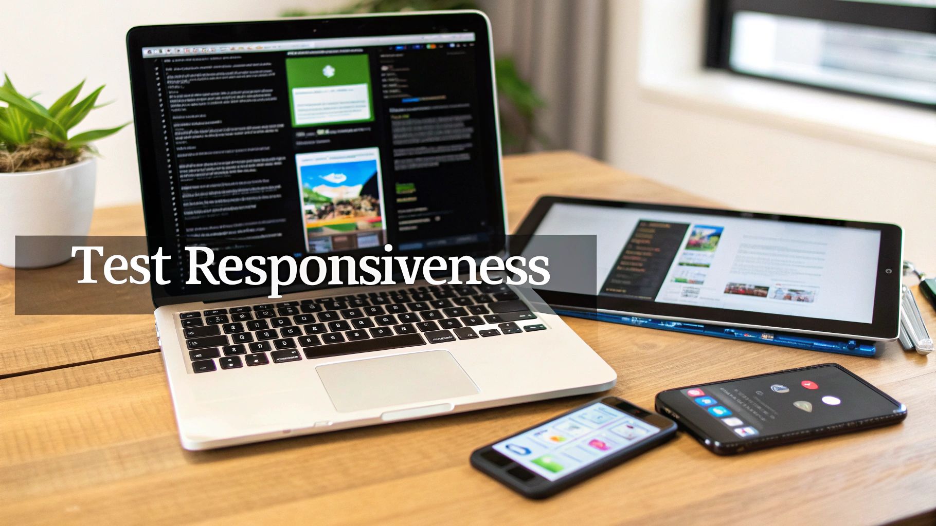
Here's a breakdown of the exact process we use, which you can follow to check your own site.
Start With Simple Browser Resizing
This is the quickest and easiest first step. On your desktop, open your website and just drag the edge of the browser window to make it narrower and wider. It’s a low-tech but surprisingly effectivegut check.
Watch how the content reacts. Do the columns stack neatly? Does the navigation menu gracefully collapse into a hamburger icon, or does it just look broken? This simple test can reveal obvious layout issues in a matter of seconds.
Use Browser Developer Tools for Simulation
For a more accurate technical check, every modern web browser (like Chrome and Firefox) has built-in developer tools. You can usually access them by right-clicking anywhere on your site and selecting "Inspect." From there, look for an icon that looks like a phone and tablet—that's the device simulation mode.
This tool is incredibly powerful. It lets you accurately simulate how your site will look on dozens of specific devices, from the latest iPhone Pro to various Samsung Galaxy models and Google Pixels. You can check different screen resolutions and orientations to find more subtle problems you’d otherwise miss.
Nothing Beats Real-World Device Testing
Simulation is great, but it’s not the real thing. Nothing—and I mean nothing—beats testing on actual physical devices. At our marketing agency in Melbourne, we keep a range of iPhones and Android phones on hand for this exact purpose.
When you hold a device, you notice things you’d miss on a desktop. How does it feel to tap the buttons with your thumb? Are the "tap targets" (like links and buttons) big enough? Does the site feel fast and smooth, or does it lag and stutter?
Real-world testing is the only way to truly understand the customer's experience. It helps you catch issues with touch interactions, on-screen keyboards covering forms, and real-world network performance that simulators can't replicate.
This hands-on approach is what allows us to deliver a genuinely polished user experience for our clients. It’s a non-negotiable step in our process.
Your Ecommerce Responsive Design Checklist
To help you audit your own online store, we've put together a simple checklist. Run through these points on a few different devices (or simulators) to get a clear picture of how your site is performing.
| Check Item | What to Look For | Pass/Fail |
|---|---|---|
| Navigation Menu | Does it collapse into a clean, easy-to-use mobile menu (e.g., hamburger icon)? Are the links tappable? | |
| Images and Media | Do images resize correctly without distorting or overflowing? Do videos fit the screen? | |
| Text Readability | Is the font size large enough to read comfortably on a small screen? Does text wrap properly? | |
| Buttons and Links | Are buttons and links large enough to be easily tapped with a thumb? Is there enough space between them? | |
| Forms | Are form fields easy to fill out? Does the on-screen keyboard cover important fields or the submit button? | |
| Layout and Columns | Do multi-column layouts stack into a single, logical column on mobile? Is content still in a sensible order? | |
| Horizontal Scrolling | Is there any unwanted horizontal scrolling? The entire page should fit within the screen's width. | |
| Page Load Speed | Does the site load quickly on a mobile network, not just on Wi-Fi? | |
| Pop-ups and Modals | Are pop-ups easy to close on a small screen? Do they block essential content? | |
| Click-to-Call | Do phone numbers automatically trigger the phone's dialler when tapped? |
Going through this checklist is the difference between a site that simply works on mobile and one that feels great to use. It’s a small effort that pays huge dividends in user satisfaction and conversions.
Ready to Build a Website That Converts?
Look, a responsive website is the bare minimum these days—it's the non-negotiable price of entry for any serious ecommerce business. But we believe a site should do more than just adapt. It needs to sell.
That means going beyond the basics to obsess over lightning-fast mobile load times and designing an intuitive user journey that guides customers effortlessly toward checkout. It’s the difference between a website that just exists and one that actively grows your business.
As a marketing agency based in Melbourne, we’ve worked with countless ecommerce businesses across Sydney, Brisbane, and Perth, turning their websites into their most powerful sales asset. Our deep expertise in both Shopify and WordPress development ensures your site is built on a solid, scalable foundation that looks perfect on every single screen.
But a great website is only half the battle. We combine our technical skills with targeted Google and Facebook Ads campaigns to drive the right kind of traffic to your store. We handle the whole lot—from the initial Google Tag Manager and Meta Conversions API setup to the ongoing creative testing and optimisation, ensuring your ad spend delivers real, measurable growth.
From crafting custom Shopify apps that solve unique business problems to mastering local SEO for your Google Business Profile, our holistic approach covers every angle. If you're ready to get serious about your online store's performance, we're the digital marketing agency in Melbourne ready to help you succeed.
Alpha Omega Digital is a marketing agency based in Melbourne, Australia but also services clients from Sydney, Brisbane, Newcastle, Perth, Adelaide, Darwin and Hobart. Have a project in mind? Let's have a chat.
Got Questions About Responsive Design? We’ve Got Answers.
Over the years, our clients have asked some brilliant questions about what responsive web design actually means for their business. As a digital marketing agency in Melbourne, we love clearing up the confusion. Here are the most common things we get asked, with straightforward answers.
Is Responsive Design the Same as a Mobile-Friendly Site?
Not quite, and it's a subtle but super important difference.
"Mobile-friendly" can sometimes just mean the desktop site shrinks to fit a small screen. You’ve probably seen it before—tiny buttons you can't tap, text you have to pinch-to-zoom to read. It technically works on a phone, but the experience is terrible.
Responsive design, on the other hand, is much smarter. The layout actively reconfigures itself. Columns stack neatly, navigation menus transform into mobile-friendly "hamburger" icons, and images resize to fit perfectly. A truly responsive site is always mobile-friendly, but not all mobile-friendly sites are responsive.
How Does Responsive Design Affect SEO?
It has a massive impact on your rankings.
These days, Google uses "mobile-first indexing," which means it primarily looks at the mobile version of your site to figure out where you should rank. A responsive website delivers a far better user experience, which lowers bounce rates and increases the time people spend on your site—both are powerful, positive signals to Google.
Plus, having a single URL for all devices makes it much easier for Google to crawl and index your site. It just simplifies everything and gives your SEO a serious boost by ticking all the boxes search engines want to see.
Can My Existing Website Be Made Responsive?
In most cases, yes, it’s possible. But the real question is whether it's worth it. The complexity and cost depend entirely on how your site was originally built.
For older websites with rigid, fixed-width layouts, trying to retrofit responsiveness can be like renovating a very old house—sometimes, it’s more work than just starting fresh.
Honestly, we often find it's more cost-effective (and gives you a much better result) to rebuild using a modern, responsive theme. This is especially true for platforms like Shopify and WordPress, where brilliant, flexible templates give us a solid foundation for a killer user experience.
What Is the Difference Between Responsive and Adaptive Design?
This is a great technical question. They both have the same goal—a great experience on any device—but they get there in completely different ways.
- Responsive design uses one fluid layout that stretches or shrinks to fit any screen size. Think of it as a single, flexible template that just works everywhere.
- Adaptive design uses several distinct, fixed layouts for specific screen sizes (e.g., one for phones, one for tablets, one for desktops). The server detects the device and sends the correct, pre-built layout.
Responsive is far more common today because of its flexibility. With so many new device sizes constantly hitting the market, a single fluid layout is just much more practical and future-proof.
Alpha Omega Digital is a marketing agency based in Melbourne, Australia but also services clients from Sydney, Brisbane, Newcastle, Perth, Adelaide, Darwin and Hobart. Have a project in mind? Contact us.