Let's clear up the confusion around UX and UI. It’s a mix-up I see all the time, especially with eCommerce clients here at our marketing agency in Melbourne. And it’s completely understandable. But getting the distinction right is the first step toward building a website that actually sells.
To put it simply, User Experience (UX) design is about the entire journey a customer takes with your website. It’s all about how it feels. In contrast, User Interface (UI) design covers what the customer sees and interacts with—in other words, how it looks.
They’re two sides of the same coin, and for a site to work, they have to work together seamlessly.
Defining UX and UI Without the Jargon
I find the easiest way to explain the difference is with a simple house analogy.
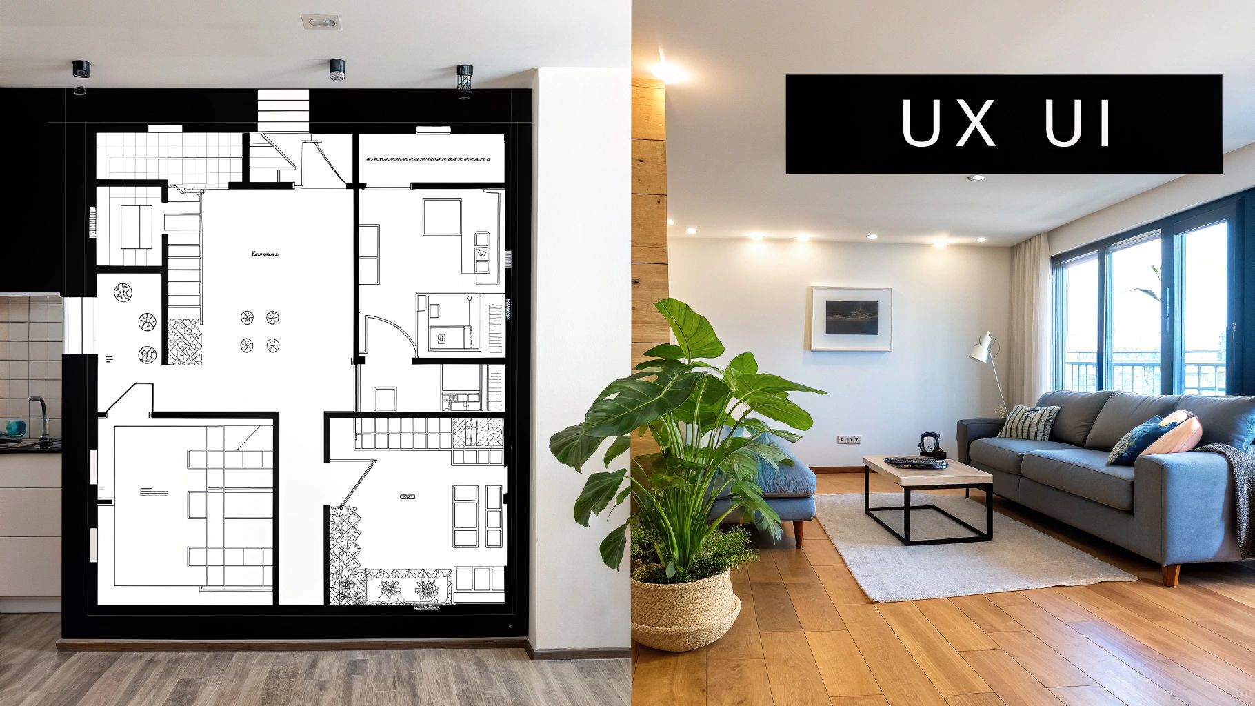
The Blueprint Versus the Interior Design
Think of UX (User Experience) as the architectural blueprint for a new house. It’s the strategic thinking that goes into the structure itself. It ensures there's a logical flow from the front door to the kitchen, that the bedrooms get the morning sun, and that the light switches are exactly where you'd expect them to be.
Good UX is all about the structure, the flow, and making the house easy and intuitive to live in. It answers the question, "How does this feel to navigate?"
Then you have UI (User Interface), which is the interior design. This covers all the visual and interactive elements you add once the walls are up. It's the colour of the paint, the style of the furniture, the texture of the curtains, and the type of light fittings you choose.
UI is what makes the house beautiful, inviting, and easy to interact with on a visual level. It answers the question, "How does this look and what can I interact with?"
You can have a house with a flawless blueprint (great UX) but terrible interior design (bad UI), making it an unpleasant place to be. Conversely, a beautifully decorated house with a confusing layout (bad UX) is just as frustrating.
For an eCommerce business, this distinction is critical. A fantastic user experience ensures there’s a clear, frictionless path from discovering a product all the way through to checkout. At its core, great UX/UI design is about applying foundational human-centered design principles to solve real user problems.
One without the other is a recipe for abandoned carts and lost sales. They must work in perfect harmony.
To make it even clearer, here’s a quick breakdown of how UX and UI differ in practice.
UX vs UI at a Glance
| Aspect | UX Design (The Journey) | UI Design (The Visuals) |
|---|---|---|
| Core Focus | The overall feel of the experience and how it works. | The look and feel of the interactive elements. |
| Main Goal | To make the product or service useful, usable, and enjoyable. | To make the interface visually appealing and intuitive. |
| Key Activities | User research, persona creation, wireframing, prototyping, usability testing. | Visual design, colour palettes, typography, button styles, animations. |
| Asks Why? | "Does this checkout flow make sense to the user?" | "Is this button clear and easy for the user to see?" |
| Delivers | Wireframes, prototypes, journey maps, research findings. | Style guides, mockups, design systems, icons. |
This table shows just how intertwined yet distinct the two disciplines are. You need the strategic thinking of UX to build the foundation and the creative execution of UI to bring it to life.
Why Smart Design Is Your Secret Weapon for Conversions
Let's connect the dots between design and your business goals. Running a digital marketing agency here in Melbourne, I’ve seen firsthand how thoughtful UX/UI directly hits the bottom line. This isn't just about making things look pretty; it's about making money.
A great user experience is like a brilliant salesperson. It guides visitors, removes friction, and makes it incredibly easy for them to pull out their wallets and become customers.
From Clicks to Customers
For an eCommerce store, this means fewer abandoned carts and higher average order values. A confusing or clunky checkout process is the perfect example of bad UX, and it’s a guaranteed way to lose a sale you’ve already earned. We’ve all been there—ready to buy, but the site makes it so difficult we just give up and close the tab.
On the other hand, a polished and professional User Interface (UI) builds instant trust. It sends a clear message that your business is legitimate, reliable, and actually cares about its customers. That first impression is crucial; it convinces visitors to stick around long enough to see what you’re selling.
When someone lands on your site, they make a snap judgment. Good UI says, "You're in the right place; this is a professional operation." Good UX makes sure their journey from that first click to the final purchase is completely seamless.
The Financial Impact of Good and Bad Design
The numbers don't lie. Poor UX is a direct cause of high bounce rates and abandoned carts. But flip that around, and a well-designed interface can be a massive growth lever. Research from Forrester has shown that a smart UI can boost conversion rates by up to 200%.
For a Melbourne startup launching a new WordPress site, even minor UX/UI tweaks can lead to soaring session times. We saw this with a company called PredictionStrike, which experienced a staggering 3,637% increase after their redesign.
This isn't a fluke; it's what happens when you put the customer first. When you invest in understanding and improving how people interact with your site, you’re investing in your own success. To dig deeper into this, you can explore the direct relationship between UX and conversion rate.
Every single design choice, from the layout of a product page to the colour of a "Buy Now" button, influences user behaviour and, ultimately, your sales figures. That's how we connect these design principles to real-world outcomes like more sales and a better return on your ad spend.
Our Practical UX/UI Design Process From Start to Finish
So, how does great design actually happen? It's not about guesswork or waiting for a flash of random inspiration. As a Melbourne-based agency owner, I can tell you it's a structured, collaborative process designed to get predictable, high-quality results every single time. Here’s a look at the six-step framework we use for every project.
This structured approach makes sure that good UI builds trust, which leads to an intuitive UX, and ultimately, more sales for your business.
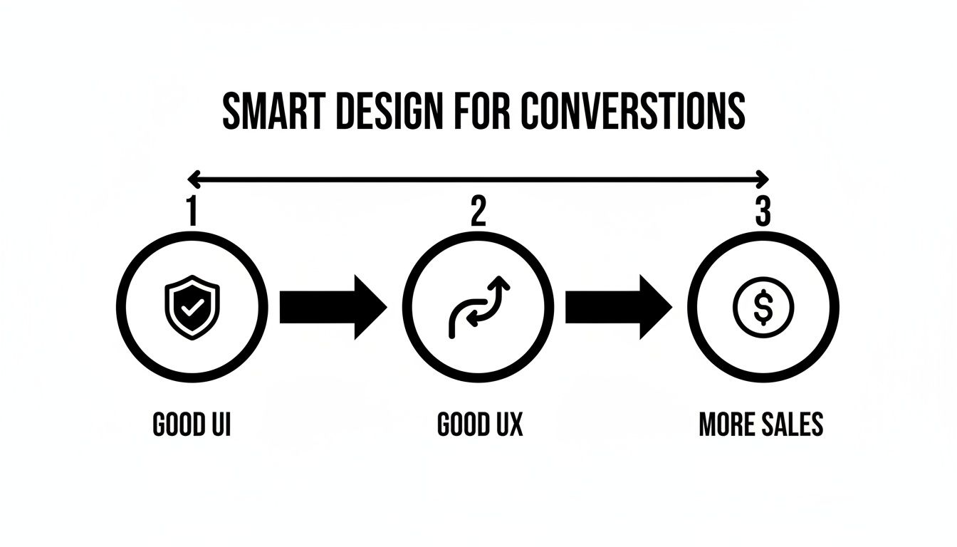
This visual shows the direct line from polished visuals to a seamless user journey and, most importantly, to your bottom line.
Step 1: Discovery and Strategy
This is easily the most critical phase. Before we even think about design, we dive deep into your business. What are your goals? Who is your ideal customer? What problems are they trying to solve when they land on your site?
We look at your competitors, analyse your current analytics, and define what success looks like in clear, measurable terms. It's all about building with purpose from day one.
Step 2: Research and Wireframing
With a clear strategy locked in, we move to the foundational 'skeleton' of your website. Our team conducts user research to understand behaviours and expectations. Then we create wireframes—basic, black-and-white layouts that focus purely on structure, information hierarchy, and user flow, without any visual distractions.
This step answers crucial questions like, "What is the most logical path for a user to find a product and check out?" It's all about function over form at this stage.
Step 3: UI Design and Branding
Once the blueprint is approved, our UI designers get to work bringing it to life. This is where we apply your brand's visual identity—your logo, colour palette, typography, and imagery. We create high-fidelity mockups that show exactly how the final website will look and feel on different devices.
This isn't just about making it pretty; it's about using visual design to create hierarchy, guide the user's eye, and build an emotional connection with your brand.
Step 4: Prototyping and User Testing
Next, we turn the static designs into interactive prototypes. Think of these as clickable mockups that simulate the real user experience, allowing us to test our assumptions before a single line of code is written.
We then conduct usability testing with real users. Watching people interact with the prototype is invaluable for identifying friction points or areas of confusion that we can fix early on.
This testing phase is non-negotiable. It’s far cheaper and faster to fix a design flaw in a prototype than it is to rebuild a feature after it's already been developed.
Step 5: Development Handoff
With a validated design in hand, we prepare for the final stage. Our team creates a comprehensive design system with all the assets, style guides, and specifications needed for development.
We then collaborate closely with our technical teams—whether they are in-house WordPress developers or our trusted Shopify partners—to ensure the design vision is executed perfectly.
Step 6: Launch and Iterate
Our job doesn't end at launch. We monitor the site's performance using tools like Google Analytics and gather user feedback to identify opportunities for ongoing improvement.
The best websites are never truly 'finished'—they evolve based on real-world data and changing customer needs.
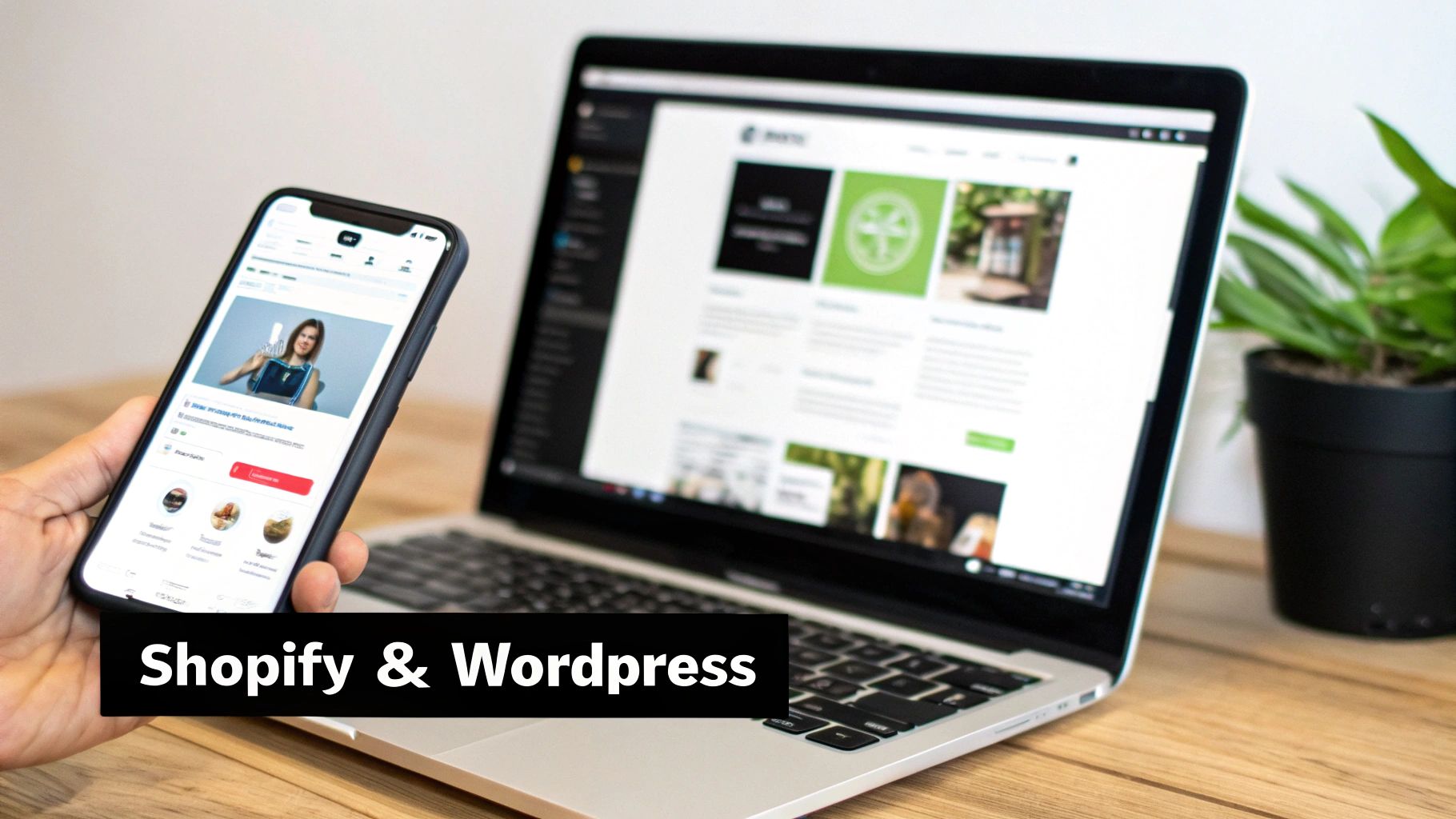
Putting Design into Practice on Shopify and WordPress
Theory is one thing, but seeing how UX and UI actually work in the real world is where it gets interesting. At my marketing agency here in Melbourne, we live and breathe this stuff every day. Our two main playgrounds are Shopify for eCommerce and WordPress for service-based businesses. The end goal might be different for each, but the core principles of good design are universal.
Shopify Design for Driving Sales
For any eCommerce brand running on Shopify, just about every design choice can be traced back to revenue. When we take on a Shopify project, our entire focus is on making the path to purchase as frictionless as possible. The tiniest bit of confusion or a clunky step can be the difference between a sale and another abandoned cart.
Here are a few real-world examples of what that looks like:
- Rethinking Product Filters: A customer shouldn't have to scroll for days. We often improve the UX of filtering systems—making it dead simple to sort by size, colour, or price—so people find what they’re looking for in seconds, not minutes.
- Streamlining the Checkout: I've seen stores with five or even six steps to check out. By redesigning this flow down to just three clear, simple stages, we can slash cart abandonment rates. This is pure UX in action, and it has a direct impact on the bottom line.
- Nailing Mobile Navigation: With over 79% of traffic to Shopify stores now coming from mobile, a clean, thumb-friendly menu (UI) isn't just a nice-to-have; it's essential for a positive user experience (UX).
Every single tweak is about making the journey from browsing to buying as smooth and intuitive as it can possibly be.
WordPress Design for Generating Leads
When it comes to a service-based business using WordPress, the game changes. Here, the main goal is usually lead generation—getting that phone to ring or a contact form filled out. The design challenges are different, but the impact is just as crucial. It’s all about building trust and prompting action.
A service business website isn't just a digital brochure; it's your hardest-working salesperson. Simple UI changes can be the equivalent of giving that salesperson a better script, leading to more qualified leads.
For instance, we might focus on things like:
- Boosting Button Contrast: Making a 'Request a Quote' button pop with a high-contrast colour is a tiny UI adjustment that can give submission rates a serious lift.
- Fixing Contact Forms: Long, intimidating forms are a huge conversion killer. We often redesign them to be shorter, friendlier, and less formal, which makes potential clients far more likely to get in touch.
As experienced WordPress developers in Melbourne, we also think about what’s happening behind the scenes. We’ll build custom Gutenberg blocks with usability in mind, making sure your team can actually update the content without breaking the design. This complete approach to what is UX/UI design ensures the site works brilliantly for your customers and your staff.
Good Design Isn't an Expense – It's Your Best Investment
From my years running a digital marketing agency here in Melbourne, I can tell you that cutting corners on design is one of the most expensive mistakes a business can make. It might feel like you're saving a few bucks upfront, but the hidden costs of a poor user experience will absolutely bite you down the track.
Bad design isn’t just about a site that looks a bit dated. It’s about a site that just doesn't work. It leads directly to frustrated users who can't find what they need, which means lost sales and a brand reputation that’s slowly being chipped away. Eventually, you’ll end up paying to rebuild the whole thing anyway, costing you far more than if you'd just done it right from the start.
Shifting Your Mindset from Cost to Return
I want you to stop thinking about design as a line-item expense. Start seeing it for what it is: a strategic investment with a measurable return. A smart investment in design leads to real, tangible business outcomes, like higher customer lifetime value and significantly better conversion rates on your Google Ads campaigns. It builds a more resilient, more profitable business.
Let's talk numbers. The financial reality of skimping on UX/UI design hits Australian small businesses hard. For instance, hiring a single senior in-house UI/UX designer can cost a business AUD$130,000–$170,000 per year. Once you factor in superannuation, that figure can easily push past AUD$200,000. While that sounds like a lot, it pales in comparison to the revenue lost from bad design.
Research from Forrester consistently shows that a well-designed UI can lift a website's conversion rate by up to 200%. A deeper investment in the entire user experience can push that number to an incredible 400%. You can learn more about how design talent impacts business success.
When you start viewing design through the lens of Return on Investment (ROI), the whole conversation changes. It’s no longer about "How much does a website cost?" but "How much revenue can a great website generate for me?"
The Agency Advantage
This is exactly where partnering with an agency makes so much sense for most businesses. Instead of taking on the significant overhead of a full-time senior designer, you get access to an entire team of specialised experts—strategists, UX researchers, UI designers—for a fraction of the cost.
For our clients, this means they get top-tier design thinking without the six-figure salary commitment. We focus on turning that investment into a powerful business driver that pays for itself many times over. The goal is to build an asset that not only looks professional but actively works to grow your business, every single day.
How to Partner with a UX UI Design Agency
So, you're ready to improve your website's performance and you're thinking about bringing in an agency. It’s a big decision, and honestly, the success of the project hinges on finding the right partnership. It’s got to start with clear communication and a shared vision from day one.
Getting Ready for Our First Chat
Before we even jump on a discovery call, a little homework on your end goes a long way. The more clarity you have about your own business, the more productive that initial conversation will be for both of us.
Try to get clear on these key questions:
- What are your main business goals right now? Are you trying to boost online sales, get more qualified leads through the door, or simply build a stronger brand presence?
- Who is your ideal customer? Paint a picture for us. What do they care about? What are their frustrations?
- What’s not working on your current site? Be specific. Tell us about the friction points you’ve noticed or the complaints you’ve heard from customers.
Doing this groundwork helps us translate what your business needs into a design solution that actually works.
How We Build a Partnership Together
A successful design project is a true collaboration, not just a transaction where you hand something off and hope for the best. We believe in total transparency, which is why we’ve refined a clear, six-step process that keeps you involved at every critical stage.
From the initial strategy sessions to the final launch day, we work side-by-side with you. This ensures the final product doesn't just look amazing—it also delivers the real-world, measurable results your business is looking for.
Alpha Omega Digital is a marketing agency based in Melbourne, Australia but also services clients from Sydney, Brisbane, Newcastle, Perth, Adelaide, Darwin and Hobart. Have a project in mind? Get in touch with us.
Got Questions? Here Are a Few Common Ones
Over the years, I've heard a lot of the same questions from business owners trying to wrap their heads around UX and UI. Here are some quick, straight-to-the-point answers.
Can I Just Focus on UI if My Budget Is Tight?
It’s a tempting thought, I get it. But honestly, it’s like building a beautiful house on a shaky foundation. A stunning-looking website won't save a confusing user experience.
If your customers can't find what they need or figure out how to buy from you, they'll leave, no matter how good it looks. It's always a smarter investment to get the UX foundation right first. Good UX is what actually drives sales and leads, not just pretty colours.
How Do You Actually Measure the Success of a New Design?
We don’t guess; we measure. Using tools like Google Analytics and Google Tag Manager, we track the hard numbers that connect directly to your business goals.
We're looking at things like:
- Conversion Rates: Are more people buying, signing up, or filling out your contact form?
- Bounce Rates: Are fewer people leaving after seeing just one page?
- Session Duration: Are users sticking around and engaging with your content for longer?
- Task Completion Rates: Can people successfully do what they came to your site to do?
For an online store, we’re glued to metrics like cart abandonment and average order value. Success isn't a feeling—it's seeing a measurable, positive lift in these core numbers.
How Long Does a UX/UI Design Project Usually Take?
This really comes down to the size and complexity of the project. A single, focused landing page might only take a couple of weeks to get right.
On the other hand, a full redesign of a large Shopify store with custom features could easily take several months. That’s why our discovery process is so important—it lets us map out a clear scope and give you a realistic timeline right from the start. No surprises, just a clear plan.
Alpha Omega Digital is a marketing agency based in Melbourne, Australia but also services clients from Sydney, Brisbane, Newcastle, Perth, Adelaide, Darwin and Hobart. Have a project in mind? Contact us.