A supporter sees a moving campaign story on their phone, taps Donate, and expects to finish in a minute or two. Instead, the page loads slowly, the purpose of the appeal is buried, the form asks for information that has nothing to do with payment, and the only payment option feels unfamiliar. The donor closes the browser, not because they stopped caring, but because the website made giving harder than it needed to be.
That moment is the true test of fundraising website design. A polished colour palette can't rescue a confusing donation journey. The strongest sites combine clear storytelling, credible proof, accessible interfaces, reliable payment integrations, and measurement that shows exactly where supporters hesitate.
Australian organisations have a particularly strong reason to treat their website as a transaction and campaign platform. Donations processed through the Australian GiveNow platform rose from approximately AUD 588,153 in 2005–06 to AUD 2.85 million in 2008–09, an increase of about 385%, while online appeals rose from 783 to almost 1,600 by early 2010, according to Our Community's historical fundraising data. The design lesson is straightforward: your website shouldn't merely explain the mission. It should help the right person understand, trust, and complete an action.
Understanding the Donor Journey
A potential donor usually arrives with more emotional momentum than technical patience. They may have watched a campaign video, received a message from a friend, read an appeal after a local event, or searched for an organisation supporting a cause close to them. By the time they reach the donation page, their question isn't “Does this website look modern?” It is “Can I trust this organisation, and can I help without wasting time?”
Consider a donor on a mobile phone during a short break. The campaign page tells a compelling story, but the donation button sits below several large image blocks. The checkout opens on a third-party domain with different branding. The form asks for a full postal address before showing payment options. A validation error removes the amount they entered. Each problem is small, but together they turn goodwill into hesitation.

Map the journey before changing the layout
I start by mapping the donor's route rather than choosing colours or page sections. The route normally includes:
- Trigger: The person encounters a story, appeal, event, search result, email, or social post.
- Orientation: They need to understand who the organisation serves and what the campaign is trying to change.
- Validation: They look for proof of legitimacy, impact, security, and responsible fund use.
- Selection: They decide between a one-off gift, recurring donation, campaign amount, or another way to help.
- Transaction: They enter details, choose a payment method, review consent, and submit.
- Reassurance: They receive confirmation, a receipt where applicable, and a clear explanation of what happens next.
A website can lose a donor at every stage. A vague headline weakens orientation. Generic emotional language without outcomes weakens validation. A long form damages transaction confidence. An empty confirmation page wastes the first opportunity for stewardship.
Practical rule: Treat every click between the appeal and the completed donation as a question the website must answer.
Design for intent, not just traffic
Different visitors need different reassurance. Someone who already knows the organisation may want a fast donation form. A first-time visitor may need a short impact explanation, leadership details, contact information, privacy language, and an accessible financial or accountability page before committing. A returning monthly donor may respond better to a prominent recurring-gift option than to another long campaign story.
The page should preserve momentum without hiding information. Keep the primary action visible, but place supporting proof close enough that a cautious donor doesn't need to hunt through the navigation. A concise campaign summary, a specific use-of-funds statement, secure payment cues, and a real contact route often do more work than a dramatic hero animation.
The Australian donor research from McCrindle's Australian Communities Report shows why this balance matters. 81% of Australians financially supported charities or not-for-profits, 74% donated at least once a year, and 45% identified online donations as a key form of engagement during the pandemic. The same report found that 81% of Australian givers were open to online fundraising initiatives, but openness varied from 99% among Gen Z respondents to 59% among Baby Boomers.
That difference isn't a reason to create separate websites for different age groups. It is a reason to remove assumptions. Use plain labels, familiar controls, legible text, clear error messages, and enough context for someone who doesn't routinely use digital payment forms. Frictionless giving means fast for confident users and reassuring for everyone else.
Designing Frictionless Donation Forms
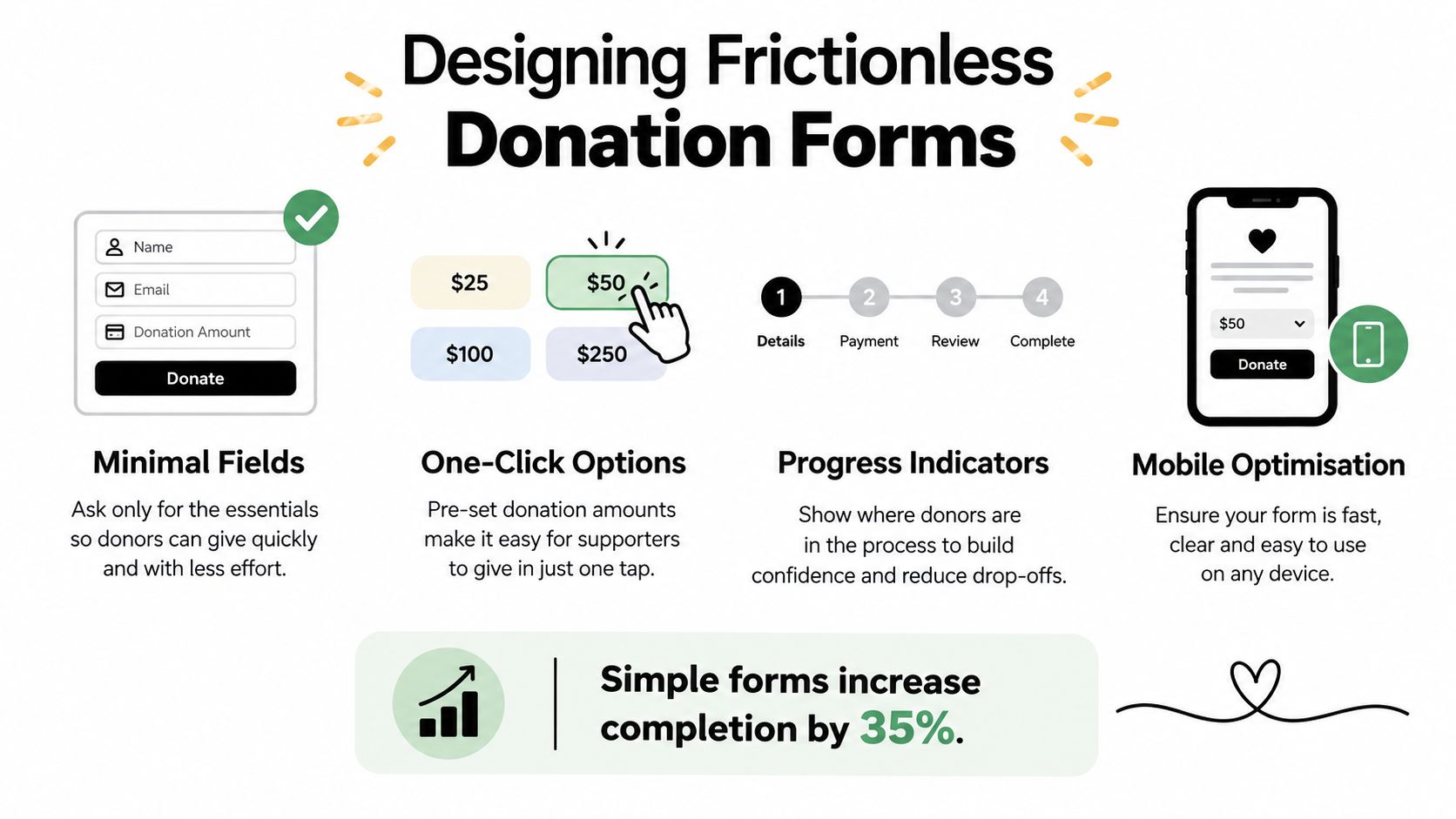
The donation form is where a supporter's intention becomes a completed transaction. It should ask for the information required to process the gift, issue a receipt where relevant, respect consent choices, and support responsible follow-up. Anything beyond those needs deserves scrutiny.
Parachute Digital's benchmark of 100 Australian charities against 59 online-donation criteria found that the average donation form requested 19 fields, while 91% of surveyed donors said they were more likely to leave a donation page that was hard to use. Those findings are documented in the Parachute Digital donation-form research summary.
Start with the minimum viable form
Before designing fields, list what your organisation genuinely needs at the point of payment. Separate operational requirements from future marketing preferences.
A practical sequence looks like this:
- Define required data: Identify what payment processing, tax receipts, consent, fraud review, and fulfilment require.
- Remove optional profiling: Don't ask for demographic, program-interest, or detailed supporter information before the gift is complete unless there is a clear reason.
- Defer enrichment: Invite the donor to update preferences after payment through a confirmation page or follow-up message.
- Label fields plainly: “Email address” is better than an abstract label such as “Primary contact identifier”.
- Explain sensitive requests: If a field is necessary, tell the donor why.
- Test the completed donation: A click on the submit button isn't the outcome. A successfully processed donation is.
A one-page form can work well when it stays short and logically grouped. A multi-step form can work when the first screen is simple, progress is visible, and the organisation doesn't use multiple steps to disguise an oversized data request. Test both against completed donations, not button clicks.
Give people clear decisions
Suggested amounts can help donors choose, but the labels must remain honest. If you show impact beside an amount, explain whether the figure represents a direct item, a contribution to a broader programme, or an illustrative allocation. Never imply that one gift alone guarantees an outcome if the organisation pools or reallocates donations.
Recurring giving should be visible without hijacking the form. A clear option such as “Make this a monthly gift” gives the donor a meaningful choice. Explain what recurring support enables, show the frequency in the review step, and make cancellation or changes straightforward.
The payment benchmark found that 65% of regular givers and 61% of one-off donors preferred credit card, while almost 40% of one-off donors preferred PayPal or direct debit. Those figures support a practical hierarchy: make card payment easy to find, then add PayPal or direct debit where the provider supports them and where those methods suit the audience.
Build for recovery, not perfection
Forms fail. Cards expire, a donor mistypes an email address, a payment provider times out, or a browser loses connection. A good donation page does not just display “Something went wrong.” It preserves the amount where possible, identifies the field that needs attention, and explains what the donor should do next.
Use visible labels rather than relying on placeholder text. Keep error messages beside the relevant field. Make the active input obvious on a phone. Ensure keyboard users can move through the form in a logical order, and don't clear every completed field when one value fails validation.
Track abandonment by field, device, payment method, and traffic source. This tells you whether the problem sits in the form itself, a particular browser experience, a payment option, or the campaign traffic arriving on the page. A high exit rate after the address field suggests a different intervention from a failure rate at payment authorisation.
The best form isn't the shortest form in isolation. It's the shortest form that still gives donors confidence and gives the organisation what it genuinely needs.
Building Trust and Transparency
Trust doesn't live in one “About us” page. Donors assess it through the entire page experience, from the wording of the appeal to the confirmation email. They notice whether the organisation explains its purpose clearly, whether the payment domain looks consistent, whether contact details are visible, and whether the funding request sounds specific or inflated.
Australian trust research makes this a design issue, not merely a communications issue. The 2025 World Giving Report recorded Australian charity trust at 8.7 out of 15, below the global average of 9.22, and 21% of non-donors said they don't believe charities use money wisely, according to the Australian World Giving Report. At the same time, 92% of donors were willing to trust charities to allocate resources for the greatest return, even when that involved spending more than 20% on marketing and quality staff.

Replace reassurance with evidence
A padlock icon helps, but it can't answer the donor's deeper concern: “What will this organisation do with my money?” Page-level proof should sit beside the relevant request.
A strong appeal can show:
- Funding use: Explain which costs the campaign supports and whether funds are restricted.
- Expected outcome: Describe what the organisation intends to achieve without promising certainty it can't control.
- Delivery responsibility: Identify the teams, partners, or communities involved.
- Reporting point: State when the organisation will publish an update.
- Scenario handling: Explain what happens if the appeal exceeds its target, falls short, or receives funds that can't be used for the stated purpose.
- Accountability route: Make contact, privacy, complaints, and financial information easy to find.
This approach is more credible than hiding operational expenditure. Staff, technology, safeguarding, administration, and measurement can all support impact. A transparent explanation gives donors a basis for trust instead of asking them to infer competence from visual polish.
Match the proof to the moment
The homepage can introduce the mission and direct people to an appeal. The appeal page should explain the immediate need. The payment screen should reassure the donor that the transaction is secure and properly handled. The confirmation page should show gratitude and set expectations for follow-up.
Don't place every trust element in a footer and assume the work is finished. If a donor reaches a campaign page from social media, they may never see the homepage. Give the campaign page its own identity, contact path, privacy link, and concise organisational explanation.
Mobile and accessibility decisions also affect credibility. A page that clips text, hides the payment button, or displays an unreadable consent notice signals poor stewardship before the donor has entered a dollar amount. Trust grows when the organisation respects the donor's time, attention, privacy, and ability to use the interface.
Trust shouldn't be manufactured with inflated urgency, vague testimonials, or emotional pressure. Specificity is stronger. Tell people what is known, what remains uncertain, how funds are managed, and when they can expect an update.
Optimising for Mobile and Accessibility
A donation page can be technically responsive and still feel unusable on a phone. The form may fit the screen, but the amount selector could be too small to tap, the keyboard could cover the next field, or the consent copy could require horizontal scrolling. Responsive fundraising website design starts with the task, not the desktop layout.
The first pass should focus on the route from campaign message to confirmation. Remove unnecessary navigation from the transaction view, keep the organisation's identity visible, and make the primary button easy to find without forcing the donor to pinch, zoom, or search.
Compare payment experiences by donor need
Australian organisations often need to balance convenience, familiarity, recurring payments, receipting, integration, and administrative control. No single payment route is automatically right for every charity.
| Payment approach | Strengths | Trade-offs |
|---|---|---|
| Card payment | Familiar for many donors and usually direct to the donation form | Requires careful handling of decline messages, expiry dates, and security reassurance |
| PayPal | Lets donors use an account they already recognise and can reduce manual card entry | The external hand-off can interrupt brand continuity if the return journey isn't designed well |
| Direct debit | Supports donors who prefer bank-based recurring or one-off arrangements | Setup can require more explanation and a clearer consent experience |
| Third-party fundraising platform | Can provide campaign tools, receipts, peer-to-peer features, or rapid launch | May create inconsistent branding, tracking gaps, and a separate checkout experience |
| Custom payment integration | Offers greater control over fields, events, and workflow | Adds development, testing, security, maintenance, and compliance responsibility |
Use whichever combination matches your audience and operational capacity. Familiarity matters, but so does reliability. A payment method that appears on the page yet fails during a campaign is worse than one you don't offer.
Treat accessibility as part of conversion
Keyboard navigation, descriptive labels, visible focus states, sufficient colour contrast, meaningful link text, and screen-reader compatibility help donors with disabilities, but they also improve usability for everyone. A person using a small phone, an older browser, or a temporary assistive setting benefits from the same clarity.
Don't encode meaning through colour alone. “Required” should appear as text, not only as a red border. Error messages should describe the problem and the fix. Images need useful alternative text when they carry information, while decorative images should not create unnecessary noise for screen readers.
Test the real device journey
Run a complete donation on the phones your team uses. Test a slow connection, a long email address, a declined card, a back-button action, an interrupted payment, and a return from PayPal. Then test the same journey with a keyboard and a screen reader.
Accessibility testing isn't a final compliance tick. It reveals whether the form communicates its state, preserves input, and provides a recoverable path when something fails. Those are conversion fundamentals even for donors who don't identify as having an accessibility need.
Choosing the Right Payment Integrations
Payment integration decisions should begin with the donation model, not the provider logo. A campaign asking for one-off gifts has different needs from a programme built around recurring support, event registration, tribute giving, or peer-to-peer fundraising.
Start by documenting the transaction from the donor's perspective and the organisation's perspective. The donor wants a familiar, secure, understandable process. The organisation needs accurate records, consent capture, receipts, reconciliation, refunds, recurring-gift management, and dependable reporting.
Choose the integration route deliberately
A hosted checkout can be the quickest way to launch and may reduce the amount of payment infrastructure your team maintains. The cost is a more limited interface and a possible shift away from the campaign page. An embedded form keeps the donor inside the site, but it requires more careful testing across browsers, devices, payment states, and accessibility tools.
A direct API connection can connect payment events to a CRM, email platform, donor database, or fulfilment workflow. It also increases the importance of secure development, logging, error handling, access control, and ongoing maintenance. “Custom” doesn't automatically mean better. It means your team owns more decisions.
Before choosing, ask:
- Can the provider handle both one-off and recurring gifts?
- Can donors see exactly what frequency they selected?
- How are failed recurring payments communicated?
- Can the organisation issue receipts or connect to its existing process?
- Does the integration pass useful transaction events into analytics?
- What happens if the payment service is unavailable?
- Can the site preserve campaign attribution without exposing unnecessary personal information?
If your team needs a practical reference for the setup itself, this guide to set up card and PayPal payments is useful when comparing payment flows and integration requirements.
Make the payment hand-off feel intentional
A third-party checkout shouldn't look like an accidental detour. Match the logo, colours, language, and campaign context where the provider allows it. Tell the donor what will happen before they click. Return them to a branded confirmation page that explains the next step.
Avoid stacking every possible payment method above the fold. Give the most familiar option a clear position, then make alternatives visible without turning the form into a catalogue of logos. Payment choice should reduce anxiety, not create another decision problem.
Recurring donations need additional care. Show the amount, frequency, first payment timing, renewal behaviour, and cancellation route before submission. The donor should never have to interpret a vague phrase such as “ongoing support” to understand what they are authorising.
Implementing Analytics and Continuous Improvement
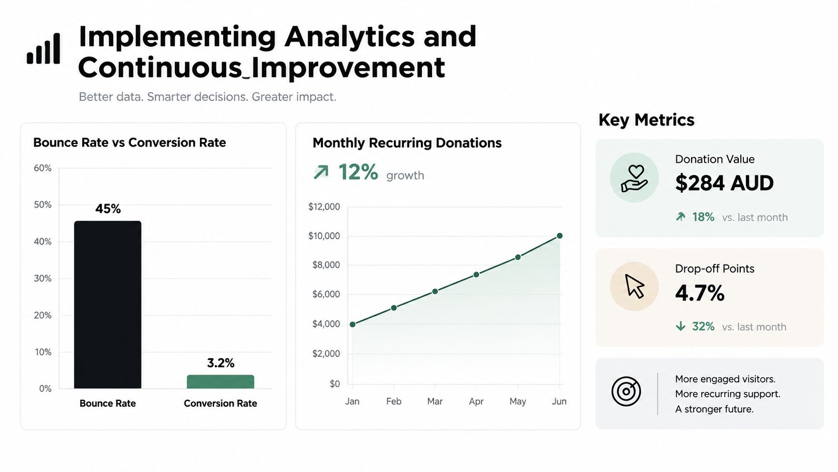
A donation journey can look healthy in a monthly report while losing supporters at one field, device, or payment step. A useful fundraising website records the path from campaign message to completed gift, payment outcome, and follow-up, so the team can see where intent turns into action or disappears.
Configure events for campaign-page views, donation-button clicks, form starts, field errors, payment-method selection, completed donations, recurring-gift selection, confirmation-page views, and abandoned journeys. Keep event names consistent across campaigns. That lets the team compare journeys without rebuilding its reporting model after every launch.
Measure outcomes rather than surface activity
A campaign page can attract attention without generating support. Track completed donations, donation value, recurring-gift uptake, source quality, form abandonment, payment failures, and the time between a campaign visit and a completed transaction. Review those results by device, landing page, traffic source, campaign, and payment route. A high exit rate on one mobile field points to a different fix from weak performance across every landing page.
Google Analytics with Google Tag Manager can provide a managed event layer when the team needs one. Use a clear container structure, document every tag and trigger, and limit access to people who require it. Test in preview mode before publishing. Then confirm that transactions appear correctly in analytics and in the donor system, rather than assuming a successful thank-you page means the gift was recorded.
Privacy belongs in the measurement design. Collect only the data required for the stated purpose, provide appropriate notices, and keep unnecessary personal information out of analytics and advertising tools. A technically accurate setup can still create avoidable risk if it captures more information than the organisation needs.
Test one meaningful change at a time
Start with a friction point supported by observed behaviour:
- A campaign page receives visits but few form starts.
- Donors select an amount but abandon at address entry.
- Mobile users encounter more validation errors than desktop users.
- A recurring option is visible but rarely selected.
- One payment route produces more failures than another.
Change one major element, such as the amount selector, campaign explanation, form order, recurring-gift language, or payment presentation. Keep the completed donation as the primary outcome. A higher click-through rate is not an improvement if fewer gifts are processed.
Regular online giving grew 114% between 2012 and 2021, according to the Fundraising Institute Australia's submission to Our Community's fundraising data and the Fundraising Institute Australia submission. That growth makes diagnosis more useful than broad assumptions about donor behaviour. A charity that tracks field-level abandonment can fix in a week what a yearly redesign would miss.
A launch checklist should include:
- Message: The page states who the organisation serves, what the appeal funds, and why action matters.
- Trust: Organisational identity, contact details, privacy information, security cues, and accountability proof are visible.
- Form: Required fields are justified, labels are clear, errors are recoverable, and recurring giving is understandable.
- Payment: Card, PayPal, direct debit, or other selected methods work on real devices.
- Accessibility: Keyboard use, focus order, contrast, labels, and screen-reader behaviour have been tested.
- Measurement: Form starts, completed donations, failures, source data, and recurring selections are recorded.
- Stewardship: Confirmation, receipts, follow-up timing, and campaign reporting are ready before launch.
A fundraising website should make generosity easy while giving donors clear evidence that their information and gift will be handled properly. If your organisation needs a new donation website or a stronger conversion path, Alpha Omega Digital can help with strategy, user-focused design, WordPress development, payment journeys, analytics, and paid campaign landing pages. Review the current donor journey, identify the largest measurable point of friction, and fix that step before commissioning a wider redesign.
[email protected]
Read more insights from our team on web design, paid ads, and growth strategy.