A donor lands on your NGO's website after seeing a campaign post. The mission is compelling, the photography is strong, and the organisation has a credible track record. Then the visitor taps Donate, waits for a slow page, encounters an unclear form, and leaves before completing the gift. That failure rarely comes from a lack of goodwill. It comes from design decisions that make action harder than it needs to be.
Good NGO website design connects mission, trust, accessibility, technology, and measurement. It gives donors a clear reason to act, removes unnecessary steps, and reassures them that their money and personal information will be handled responsibly. It also helps volunteers find the right opportunity, beneficiaries locate support, and staff update the site without relying on a developer for every change.
For Australian organisations, the case for getting this right is especially practical. Only 2% of Australians lacked internet access in 2024, compared with 16% in 2010, according to Australian Government research on near-universal internet access. A website is no longer a supporting brochure. It is part of the organisation's public service, fundraising, and community infrastructure.
Why NGO Website Design Directly Impacts Donations
A common problem appears across underperforming charity websites. The organisation has invested in a polished homepage, long-form impact stories, and beautiful campaign imagery, but the donation journey feels like an afterthought. The button is difficult to find, the form asks for information the payment processor doesn't need, and the thank-you page offers no clear next step.
That gap matters because people don't experience a website as a collection of individual design elements. They experience it as a sequence of decisions. A visitor asks, often within seconds: What does this organisation do? Do I trust it? Can I see the impact of giving? How do I take action?
Australian giving behaviour reinforces the importance of that sequence. A 2025 Lonergan Research survey published by the Australian Red Cross found that 85% of 1,016 surveyed Australians had given to charity during the previous 12 months. The average reported donation was $283.29, with results varying by state and territory. That willingness to give creates an opportunity, but a website still has to convert intent into a completed transaction.
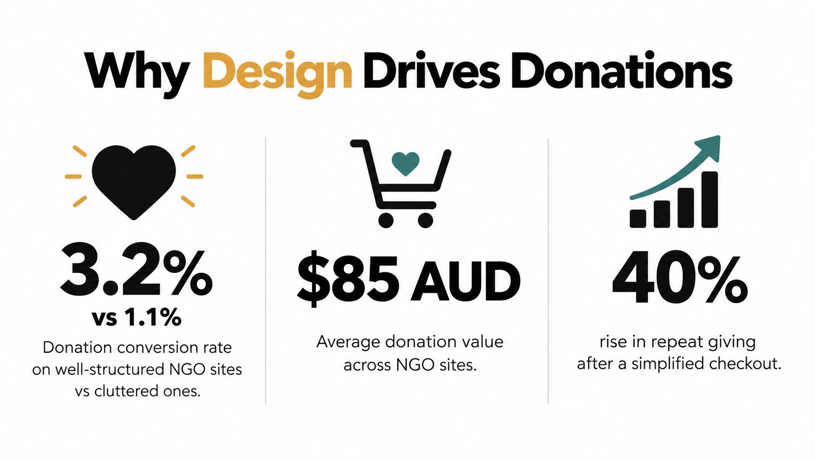
Design choices that influence donor action
A credible donation page answers practical questions without forcing a donor to search:
- Where the money goes: Explain the programme, service, or immediate need connected to the appeal.
- Who receives the benefit: Use clear language and authentic imagery, while protecting beneficiary privacy.
- What happens after payment: Confirm the receipt, explain the next communication, and provide a useful follow-up action.
- Why the organisation is legitimate: Display relevant registration, governance, privacy, and contact information.
- How to give again: Offer a recurring option without making it the only obvious path.
The Red Cross research found that 41% of regular donors made additional donations at end of financial year, while 57% expected to donate the same amount as the previous year. Those findings support a website strategy built around timely, visible campaigns rather than a donation page that remains disconnected from the rest of the site. EOFY messaging should clarify receipts, campaign purpose, and the action required, not just add urgency to a banner.
Practical rule: Treat the donation form as a product, not a widget. Give it an owner, test it on real devices, and review the complete journey after every major website or payment change.
The technical choices behind the page also affect performance. A heavy animation can hide the donate button on a phone. A third-party embed can break keyboard navigation. A long form can create uncertainty about why information is being requested. A site that looks impressive in a design review may still fail the person who arrives on a low-bandwidth connection or uses a screen reader.
This is why design and fundraising can't be separated. The strongest visual treatment is the one that helps visitors understand the mission and complete the right action. For an NGO, that might be a donation, a volunteer application, a service referral, or a contact request. The site should make each path obvious without making every visitor follow the same funnel.
Discovery and Strategy Phase for Nonprofit Websites
The most expensive NGO website mistakes usually happen before development begins. Teams choose a visual direction, approve a homepage concept, and only later discover that donors, volunteers, service users, and staff need different journeys. Discovery prevents those conflicts from becoming expensive rebuilds.
Start by listing the audiences who depend on the website. Don't use broad labels such as “the community” unless you define the people inside that group. A regional food support organisation might need separate paths for people seeking help, donors, volunteers, referral partners, and local businesses. Each audience has a different question and a different definition of success.
Build an audience evidence base
Use a combination of sources rather than relying on internal assumptions:
- Analytics review: Identify entry pages, device patterns, search queries, form exits, and high-value actions.
- Supporter interviews: Ask donors what gave them confidence, what nearly stopped them, and what they expected after payment.
- Service-team workshops: Document the questions staff answer repeatedly by phone or email.
- Usability sessions: Watch people attempt to donate, volunteer, find help, and contact the organisation without coaching.
- Content audit: Mark pages that are inaccurate, duplicated, difficult to scan, or disconnected from a meaningful action.
The Australian digital-access picture requires care in how that evidence is collected. The same government research identifies people aged 65 and older, Aboriginal and Torres Strait Islander peoples, non-employed people, people with disability, rural Australians, low-income households, and people in socioeconomically disadvantaged areas as groups more exposed to digital exclusion. That means a polished web analytics report can't represent every visitor equally.
Define measurable website jobs
A mission statement isn't a website strategy. Translate the organisation's priorities into observable tasks:
| Website objective | Visitor task | Useful measure |
|---|---|---|
| Increase giving | Complete a one-off or recurring donation | Donation completion and abandonment |
| Recruit volunteers | Find a suitable role and submit an expression of interest | Role views and completed applications |
| Improve service access | Locate eligibility, contact, or referral information | Task completion and assisted enquiries |
| Build trust | Review impact, governance, and financial information | Engagement with trust content |
| Grow supporter retention | Subscribe to updates or return to a campaign | Consent-based subscriptions and repeat visits |
Choose a primary conversion for each major landing page. A campaign page may prioritise a donation, while a service page may prioritise a referral call. If every button is styled as the main action, visitors and internal teams lose the hierarchy.
Study comparable Australian organisations
Competitive analysis isn't about copying another charity's colour palette. Review how comparable organisations explain their work, present impact, handle sensitive information, and move visitors towards action. Look at local and national groups serving similar communities, then record what is clear, what feels risky, and what questions remain unanswered.
Include the back-office reality in this work. Ask who will update events, publish campaign results, approve donation copy, manage volunteer enquiries, and respond to privacy requests. A website that staff can't maintain becomes outdated quickly. A simpler system with clear ownership often produces a better public experience.
Information Architecture and Donor Experience Design
A donor arriving from a campaign post should understand the next action immediately. A person seeking support needs a different route, with privacy, eligibility, and contact details easy to find. Information architecture should serve these tasks rather than mirror the NGO's internal departments.
A practical primary navigation might include About, Our work, Get help, Get involved, News or resources, and Donate. Labels should match visitor language, and high-intent destinations should remain visible. Replace vague headings such as “Our impact” with clearer destinations when visitors are looking for programmes, outcomes, or annual reports.

Design around distinct journeys
A donor journey should not compete with a beneficiary journey. Give each audience a clear entry point, then keep the next useful step visible.
Donors need a concise explanation of the need, evidence of credibility, impact context, and a payment path with minimal friction. Volunteers need role details, location, time commitment, screening requirements, and a realistic application process. People seeking services need eligibility, safety information, contact options, opening details, and an alternative if the online route is unsuitable.
Mobile-first design matters because the access research discussed earlier shows that nearly all Australian adults connect to the internet through mobile devices. Build responsive layouts, large tap targets, short forms, and readable content. Keep desktop performance and form usability under test as well. Donors may research on one device and complete the payment on another, so campaign context and trust signals should remain consistent across screen sizes.
Place trust where decisions happen
Trust content works best beside the action it supports. Put a concise registration or governance reference near the donation prompt, link to financial information from the campaign page, and explain recurring payments before the donor selects that option. Keep data-use information available within or beside the form, rather than making people search for it.
Use repeated but restrained calls to action. A sticky mobile donate button can help, provided it does not cover content, trap keyboard users, or compete with urgent service information. Test the interface with people who have not seen the site before. If they cannot explain what will happen after tapping a button, revise the label or the surrounding copy.
A donation journey should feel like a confident handover, not a maze of organisational information.
The confirmation experience is part of the journey. Show receipt status, provide a contact route, offer campaign updates with clear consent, and give donors a useful next step. A person who has just acted deserves certainty about what happened, especially when the payment or follow-up involves sensitive information.
CMS Selection and Plugin Ecosystem for NGOs
WordPress is often a practical choice for an NGO because it gives a small team control over pages, news, campaigns, and resources without requiring every change to pass through a developer. Its flexibility is also the main risk. A site can accumulate poorly maintained plugins, inconsistent templates, and overlapping features until basic updates become dangerous.
A managed WordPress build works well when the organisation needs a content-rich site, custom landing pages, donation integrations, event publishing, service directories, or role-based editing. Gutenberg blocks can give staff structured content components rather than a blank editor. Custom blocks are especially useful for repeatable elements such as impact cards, programme listings, campaign summaries, and accessible callouts.
Compare the practical options
WordPress offers the broadest customisation and a large ecosystem for donations, forms, events, memberships, CRM connections, and email marketing. It needs disciplined hosting, updates, backups, security controls, and plugin governance.
Shopify is designed around commerce. It can suit an NGO that sells merchandise, tickets, sponsorship packages, or fundraising products, but a donation-led organisation may need custom apps, alternative payment flows, or a connected donation service.
Hosted website builders reduce maintenance and can be suitable for a small organisation with straightforward content needs. The trade-off is less control over complex integrations, data flows, and specialised user journeys.
Dedicated fundraising platforms may provide stronger donor management out of the box. They can reduce development work, although the organisation must check branding, accessibility, Australian payment support, data ownership, and integration limits.
Keep the plugin stack intentional
Choose one primary tool for each core capability. Multiple form builders, analytics connectors, page builders, and donation plugins often create duplicate scripts and confusing data. Before installing anything, ask who maintains it, how updates are tested, where donor data is stored, and whether the feature remains usable if the plugin is removed.
Volunteer operations deserve the same attention as fundraising. A website may need role listings, availability, applications, screening, rostering, and communication. A resource such as volunteer management tools can help teams compare operational requirements before committing to a plugin-heavy approach.
Use a staging environment for updates, maintain documented administrator access, and remove abandoned plugins. The simplest maintainable stack will usually outperform an ambitious build that only one person understands.
Donation and Payment Integration Strategies
Donation forms fail when they ask donors to solve the organisation's data problem before completing a gift. A first-time supporter usually doesn't need to provide every possible preference, demographic detail, or communication field at checkout. Collect what payment, receipt, fraud prevention, and essential supporter follow-up require, then request optional information later with clear consent.
Australian giving behaviour makes clarity particularly valuable. The Red Cross research found that only 28% of respondents always included charitable deductions in their tax return, while 35% never did. A donation experience should explain what receipt the donor will receive and where they can find relevant tax information, without implying a tax outcome that the organisation can't guarantee.
Build the form around decisions
A useful form makes the important choices obvious:
- Gift type: Offer one-off and recurring giving, but explain the difference in plain language.
- Amount: Provide sensible suggestions alongside a custom amount field.
- Payment method: Support appropriate methods for the audience and test each one on mobile and desktop.
- Donor details: Request the minimum information needed to process and acknowledge the gift.
- Consent: Separate donation processing from optional marketing consent.
- Errors: Show inline messages, preserve entered values, and identify the exact field that needs attention.
Australian charity research identified under nine fields as a best-practice benchmark, while organisations requested 19 information items on average, with 15 marked mandatory, according to research on donor insights and digital dollars. That contrast is a useful warning. A form can look professional while still placing unnecessary work on the donor.
Use a reputable payment processor that supports the organisation's jurisdiction, currencies, recurring transactions, refunds, receipts, and fraud controls. Avoid storing card details in the website unless the organisation has the security capability and compliance programme to manage that responsibility. In most cases, hosted or tokenised payment flows reduce exposure.
Connect the transaction to the supporter experience
The payment event should pass reliable information to the CRM or supporter database. Record campaign source, gift type, amount, consent status, receipt status, and transaction outcome in a way staff can reconcile. Don't send a donor into a generic thank-you page if the payment failed, and don't trigger a celebratory email until the transaction is confirmed.
A well-designed campaign page can provide urgency without pressure. For ideas about structuring a campaign around participation and momentum, doornoc on winning campaign fundraising offers a useful supplementary perspective. Adapt any idea to the organisation's mission, consent obligations, and audience needs.
Test failed payments, interrupted sessions, duplicate submissions, recurring-gift cancellation, receipt delivery, and refund handling. The happy path is only one part of donation quality.
Accessibility and Trust Building for Nonprofits
Accessibility is service delivery infrastructure. If someone can't move through a referral form with a keyboard, understand an error message with a screen reader, or read a low-contrast donation prompt, the organisation has created a barrier to participation. That barrier affects beneficiaries and supporters alike.
Start with the tasks that matter most: understand the mission, locate help, donate, subscribe, volunteer, and contact the team. Test those journeys against WCAG 2.2 AA principles, including keyboard operation, visible focus, semantic headings, labelled controls, colour contrast, text alternatives, captions, error identification, and reflow at small viewport widths.
The Australian disability-accessibility context makes this work more than a technical preference. Guidance from the Centre for Accessibility Australia describes digital exclusion as an ongoing barrier and highlights practical support for people who lack reliable devices. A website team should therefore test with real users and assistive technology, not rely solely on an automated accessibility score.
Make trust visible without overwhelming the page
Donors need evidence that the organisation is legitimate and accountable. Useful trust signals include:
- Registration and governance information: Link to relevant public details and identify the responsible organisation.
- Financial transparency: Publish annual reports, programme information, and explanations of how funds are used.
- Privacy clarity: Explain what data is collected, why it is needed, who receives it, and how a person can ask questions.
- Contact access: Provide a real support route for payment, service, and privacy enquiries.
- Authentic evidence: Use current programme updates, beneficiary perspectives with consent, and specific descriptions of work completed.
Trust isn't created by adding badges to a checkout. It comes from consistency between the promise, the payment process, the receipt, and subsequent communication.
Connect accessibility with data governance
Form accessibility and privacy design overlap. Clear labels help screen-reader users and make data collection more understandable for everyone. Shorter forms reduce both abandonment and unnecessary personal-data exposure. Separate beneficiary records from marketing audiences, restrict staff access, enable multi-factor authentication, and keep CMS components updated.
The Digital Technology in the Not-for-Profit Sector report identifies cyber and data risks as a growing concern, particularly where smaller organisations rely on outdated websites and limited technical capability. Design teams should include threat modelling, payment-provider review, volunteer access, breach response, and data minimisation in the project plan.
Performance Optimization and Ongoing Analytics
A donation page can lose support before the visitor reads the appeal. Slow loading, delayed payment fields, or a form that becomes difficult to use on mobile can undermine strong copy, accessible design, and trust in the organisation. Performance work starts with the assets and scripts the page needs. Compress campaign images, serve suitable dimensions, defer non-essential scripts, cache repeatable content, and remove plugins that provide no measurable value.
Review more than the homepage. Test campaign landing pages, donation forms, service directories, volunteer applications, and confirmation pages on real devices and connections. A page can score well in a laboratory test yet feel slow when a third-party donation embed or consent manager loads in sequence. Record the effect of each change on page speed, task completion, and support requests.
Measure tasks rather than vanity metrics
Set up Google Tag Manager and Google Analytics around a documented event model. Track actions that reflect supporter and community tasks:
- Donation form started
- Donation form completed
- Payment failed
- Recurring gift selected
- Volunteer application submitted
- Service referral completed
- Contact method selected
- Newsletter consent submitted
Use consent-aware tracking and keep unnecessary personal information out of analytics tools. A report that cannot distinguish a completed gift from a button click can give the team false confidence. Define the conversion event, its source, and the device used before comparing results.
The benchmarking research cited earlier reported average conversion of 31% for appeal pages and 26% for general donation pages, with the strongest examples reaching 80% and 41% respectively. Treat those figures as research benchmarks, not a promise for every organisation. Your working baseline is your own performance by device, campaign, audience, gift type, and traffic source.
Improve the site through controlled learning
Use a cycle of research, prototyping, measurement, and testing. Benchmark the current journey first. Then watch donors complete the form, including people with disability. Test changes to copy, suggested amounts, recurring prompts, payment choices, and form length one at a time where possible, so the result remains understandable.
Separate desktop and mobile conversion. Measure abandonment at each field, time to donate, payment errors, keyboard completion, screen-reader issues, and the difference between one-off and recurring gifts. The research cited earlier found that 79% of surveyed donors were more likely to abandon a process taking longer than a few minutes, while 91% were more likely to exit when navigation was difficult. These findings make friction worth measuring directly. A responsive layout alone does not prove that the donation journey works.
Local SEO can bring people to regional services, donation appeals, events, and volunteer opportunities. Keep organisation details consistent, create useful location pages, maintain the Google Business Profile where appropriate, and answer the questions the community asks. Each page should lead to a clear task, not just produce another visit.
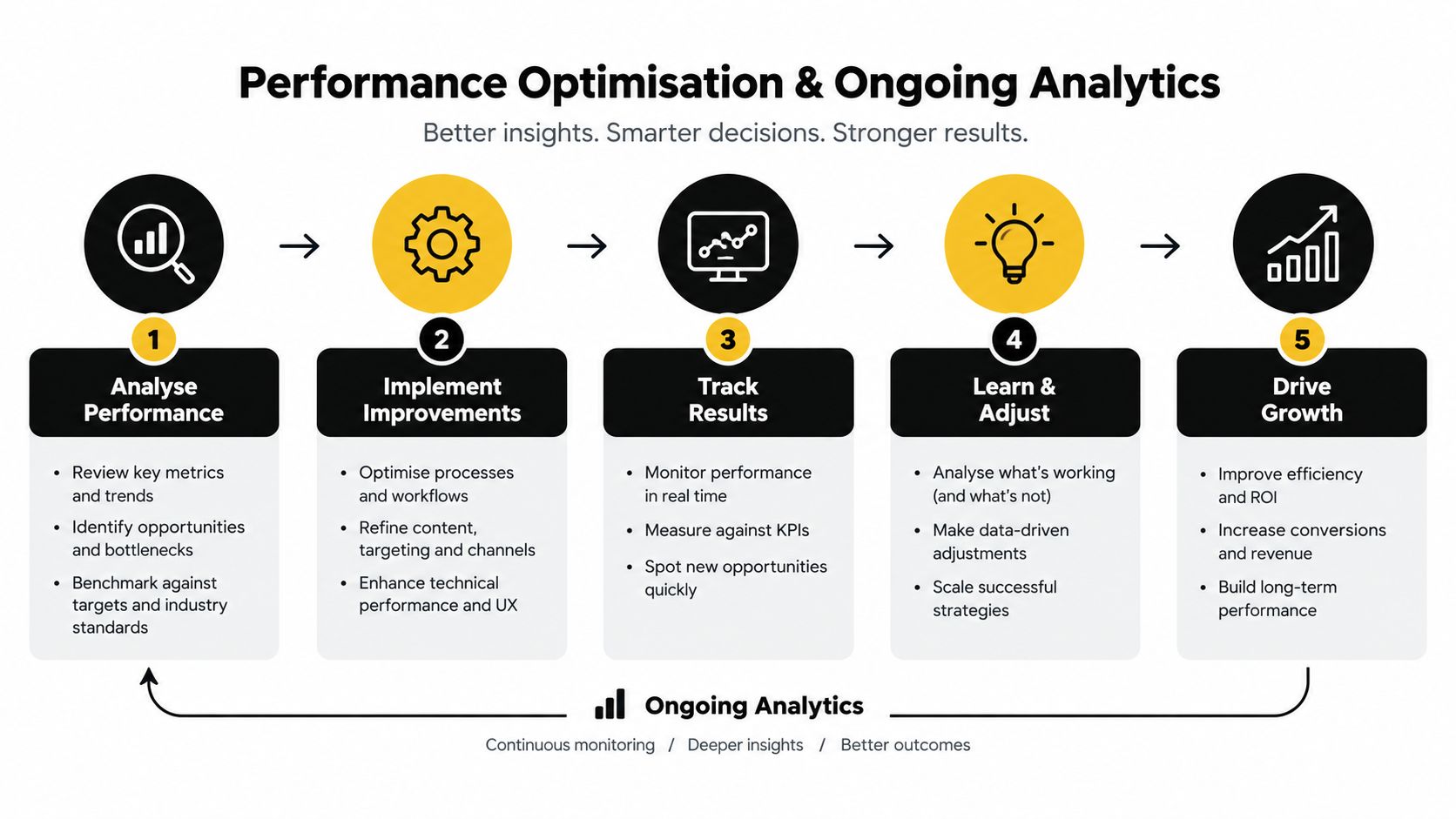
A practical review cadence keeps improvements tied to evidence. Check technical errors after releases, review donation and service funnels regularly, test accessibility after template changes, and revisit content when programmes or contact details change.
If your NGO needs a website combining accessible UX, donation journeys, analytics, and maintainable WordPress development, Alpha Omega Digital can help plan and build the experience around supporter tasks. The team works with Australian organisations on web design, development, conversion strategy, and performance measurement. Contact them with your current donation journey and the main barrier you want to remove.
[email protected]
Read more insights from our team on web design, paid ads, and growth strategy.