
If you're responsible for a church or ministry website, you're probably juggling two competing pressures. You want something that feels welcoming and true to your mission, but you also need it to work properly for real people trying to find service times, watch sermons, register for events, ask for prayer, or give online.
That tension sits at the centre of good christian web design. The strongest ministry sites don't behave like polished brochures that nobody updates. They function like a dependable front desk, a media library, a giving portal, and a quiet first conversation with someone who may never have set foot in your building.
Building Your Digital Front Door
A parent is checking your church from the car park before Sunday pickup. A man who has not attended in years is trying to find the livestream after a hospital visit. A neighbour looking for food support lands on your site at 11 p.m. None of them is admiring your branding first. They are trying to get an answer quickly.
For churches and ministries, the website now handles work that used to be spread across printed bulletins, front-desk calls, foyer conversations, and separate giving tools. It is the place where people decide whether your ministry feels clear, active, and approachable. If key paths are buried or confusing, people do not assume the website is the problem. They assume the church will be hard to reach.

What a ministry website is actually doing
A useful ministry site usually has to do four jobs at the same time:
- Welcome new visitors with clear service information, directions, kids details, and contact options
- Serve the congregation with sermons, calendars, ministry updates, and next steps
- Support operations through registrations, forms, volunteer signups, and online giving
- Extend care beyond office hours with prayer requests, support resources, and content people can access privately
That mix changes how good christian web design should be judged. The question is not whether the homepage feels inspiring. The question is whether people can complete the tasks that matter to the ministry.
I have seen churches spend weeks debating hero images while the giving flow takes too many steps, event registration breaks on mobile, or service times are hidden three pages deep. Those are not minor usability issues. They affect attendance, trust, and follow-through.
Practical rule: If a first-time visitor cannot find when to come, where to go, what to expect, and how to contact someone within a couple of clicks, the site is underperforming.
Design follows ministry function
Visual style still matters. It sets tone, reinforces trust, and helps a church feel recognisable. But design choices need to support real use.
Readable typography helps older adults and tired parents scanning quickly on a phone. Large tap targets reduce friction for anyone trying to give, register, or request help from a mobile device. Clear page structure helps a newcomer find answers without church language getting in the way. Accessibility also belongs here. Good contrast, keyboard-friendly forms, captions, and sensible heading structure are part of digital hospitality, not technical extras.
That is why I usually recommend starting with user journeys before choosing layouts. Map the common tasks. Then build pages around those tasks. Teams that do this well end up with cleaner navigation, fewer homepage distractions, and stronger conversion points for giving, event signups, and ongoing engagement.
If you're starting from scratch, browsing tools like Elementor church web templates can help teams see common page structures before committing to a build. Templates will not supply strategy, but they can give staff and volunteers a clearer standard for what a usable ministry website looks like.
Defining Your Goals and Audience
The clearest church websites are usually built around a short list of specific actions. Not vague hopes. Actual actions.
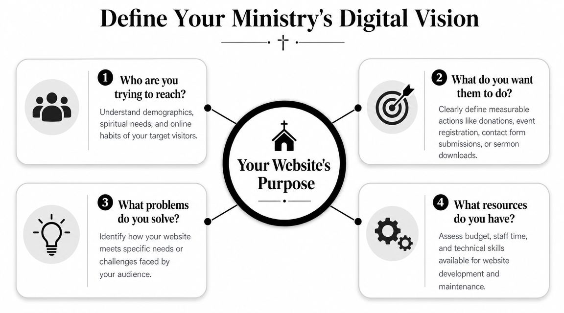
When a ministry skips this step, the site tends to become a pile of internal opinions. One team wants a big vision statement. Another wants a sermon slider. Someone else wants every ministry on the homepage. The result is usually crowded, slow, and confusing.
A cleaner approach starts with audience groups and what each one came to accomplish. That's where the project gets practical.
The people most ministry websites need to serve
Most church sites are trying to serve several audiences at once:
First-time visitors
They need service times, location details, what to expect, kids information, and a trustworthy feel.Active congregation members
They look for event details, giving, sermon replays, ministry updates, and volunteer information.Online-only attendees
They need livestream access, message archives, notes, and a way to connect beyond passive viewing.Community partners or care seekers
They often want help, contact pathways, outreach details, counselling information, or partnership contacts.
I usually advise churches to rank these groups in order. Not because the others don't matter, but because homepage hierarchy needs discipline. If every audience gets equal weight everywhere, nobody gets served especially well.
Four questions that sharpen the brief
Use these questions before you choose a theme, plugin, or platform:
- Who needs us most online right now
- What action do we want them to complete
- What information do they need before they'll take that step
- Who on staff will keep this area updated after launch
Design starts connecting to behaviour. According to Figma's web design statistics, 94% of first impressions are design-related. For a church, that first impression isn't just about taste. It's about whether the site feels organised, trustworthy, and worth exploring.
A cluttered homepage often signals internal confusion, even when the ministry itself is healthy and welcoming in person.
Turn goals into measurable website actions
For ministries, good goals are concrete. A few examples:
- New visitor goal. More people use the Plan Your Visit page
- Community goal. More attendees register for events or groups
- Care goal. Prayer request and contact forms reach the right staff member quickly
- Giving goal. Donation completion is simple on mobile and desktop
Once those priorities are clear, the rest of the build gets easier. You know what belongs in the main menu, what deserves homepage space, and what should sit one level deeper.
Core Content and Essential Features
A first-time visitor lands on your site at 10:30 p.m. on Saturday. They want to know where to park, whether childcare is available, and what to expect if they walk in alone. A member wants to give from their phone in under a minute. A parent needs to register for VBS before spots fill. Those are not edge cases. They are everyday website jobs, and the structure has to support them.
On church and nonprofit ministry sites, the biggest problem is rarely missing content. It is misplaced content. Important actions get buried under internal language, oversized homepage sections, or menu labels that make sense to staff but not to guests. A strong ministry website works as an operations hub, not a brochure. It helps people get answers, complete actions, and reach the right person without friction.
The pages that carry the workload
Some pages consistently do more work than others. They deserve clearer structure, better copy, and regular maintenance.
Plan Your Visit or New Here
This page should remove uncertainty fast. Include service times, location, parking, kids check-in, accessibility details, and a plainspoken summary of what the service is like.Sermon archive
Organise messages by series, speaker, topic, and date where possible. Video helps, but short summaries, transcripts, or key passages help people decide what to watch and improve usability for people who cannot listen easily.Events calendar
Accuracy matters more than styling. If events stay posted after they have passed, visitors start doubting the rest of the site too.Ministry pages
Kids, youth, care, groups, missions, and outreach pages should answer three questions clearly. Who is this for? When does it happen? How do I join or ask a question?
A quick visual walk-through can help teams think about layout decisions before they finalise content:
Giving, registrations, and forms deserve product-level attention
Giving is one of the clearest trust tests on a ministry website. If the donation flow looks disconnected, loads slowly, or becomes awkward on mobile, completion rates drop. The same applies to event registration, prayer request forms, volunteer signups, and contact forms.
Teams often focus on visual design and treat forms as a plugin decision. That causes problems later. Forms need reliable routing, confirmation messages, spam protection that does not block real users, and field layouts that are easy to complete on a phone. Donation tools also need keyboard access, readable labels, and error handling that tells people exactly what to fix. The wcag compliance checklist is a useful reference when reviewing those details.
Common failures show up in the same places:
- Broken form routing that sends enquiries into an inbox nobody checks
- Weak validation that accepts bad data or gives unclear error messages
- Donation embeds that are hard to use on small screens or with assistive tech
- Long mobile forms that ask for too much before the user commits
- No tracking setup for completed gifts, registrations, or form submissions
That last point matters more than many church teams expect. If you cannot see which pages lead to completed actions, it is hard to improve the site with confidence.
Trust is often won on the plain pages
The pages that look least exciting often answer the questions people have.
| Content area | Why it matters | What often goes wrong |
|---|---|---|
| Staff page | Helps people know who leads and who to contact | Outdated roles, missing photos, no direct next step |
| Statement of faith | Helps visitors assess fit and theological clarity | Dense internal language with no summary |
| Contact page | Gives a clear path for help, prayer, or questions | One generic inbox for every type of enquiry |
| Resource library | Extends ministry beyond Sunday services | Inconsistent formatting and poor filtering |
I have seen churches spend weeks debating homepage imagery while the contact page still sends pastoral care requests to a dead email address. That is the trade-off. Small content decisions affect trust, follow-up, and ministry operations every week.
Strong christian web design keeps high-intent paths obvious, keeps content current, and treats accessibility, giving, and communication tools as part of the ministry itself. The best sites usually feel simpler than the internal planning process behind them.
Faith-Sensitive and Inclusive Design
Faith-sensitive design isn't about covering every page with church imagery or symbolic language. It's about creating a digital environment that feels calm, trustworthy, readable, and considerate.
That usually starts with restraint. Too many churches try to communicate warmth by adding more visual layers, more overlapping text, more auto-rotating hero sections, and more decorative effects. The result often feels less welcoming, not more. People don't experience clutter as care.
Design choices that feel human
A faith-aware site tends to work well when it leans on a few practical decisions:
- Readable typography with generous spacing and clear heading hierarchy
- Authentic photography showing the actual congregation, building, and ministry life
- Consistent tone of voice that sounds pastoral and direct, not corporate or vague
- Simple navigation labels like Give, Watch, Visit, Contact, Ministries
Real photos matter more than stock images in this space. Visitors can tell when a ministry feels represented by its own people. Even modest photography usually outperforms polished but generic images because it gives the site credibility.
The most welcoming church websites don't try too hard to look spiritual. They try hard to be clear.
Accessibility is part of ministry, not a compliance add-on
At this stage, many christian web design projects either achieve complete inclusivity or implicitly exclude part of the congregation.
In Australia, about 21.4% of the population reported a disability in 2022, and the share rises with age, which makes accessibility especially relevant for churches serving older communities (accessibility and disability context). If your site handles public information, donations, or event registration, designing to WCAG 2.2 AA is the responsible baseline.
That means checking things such as:
- Keyboard navigation so users can move through menus, buttons, and forms without a mouse
- Colour contrast so text remains readable over backgrounds and hero images
- Form labels and focus states so interactive elements are obvious
- Alt text and captions so images and video content remain accessible
- Zoom at 200% so layout and readability hold together under magnification
If your team needs a practical reference during QA, a structured wcag compliance checklist is useful for manual review before launch and after major content changes.
Common mistakes that make church sites harder to use
The failures are usually ordinary, not dramatic:
- low-contrast text over photography
- decorative sliders that interrupt reading
- unclear button labels
- PDFs uploaded instead of web pages
- inaccessible third-party giving tools
- sermon videos without captions
Ministries often talk about serving everyone. Accessibility is where that claim becomes visible online. A site that works well for screen readers, keyboard users, older members, and mobile visitors communicates care without saying a word.
Choosing the Right Technology Platform
A church can launch a beautiful website and still end up with a daily headache if the platform is wrong. I have seen ministries choose software based on a polished demo, then hit problems six months later when staff need to post sermons, update events, connect giving tools, or fix a broken form without calling a developer.
The right platform supports ministry work behind the scenes. It should make weekly publishing manageable, keep operating costs predictable, and fit the systems your team already uses for people, events, communication, and donations.
What usually separates the options
WordPress fits churches that need flexibility. It handles custom content types, sermon libraries, staff directories, gated member resources, and more advanced integrations better than most entry-level builders. The trade-off is maintenance. Someone needs to manage updates, plugin quality, permissions, backups, and content structure with discipline.
Squarespace and Wix reduce setup complexity. For a smaller church with a simple page set and a staff member who just needs to edit text, swap photos, and publish announcements, that simplicity can be a good choice. The limitation shows up later if the site needs custom registration flows, a more capable sermon archive, CRM syncing, or deeper reporting on key actions.
Church-specific platforms sit in the middle. They often include sermons, events, and giving tools out of the box, which can shorten setup time. The cost is flexibility. If the built-in tools do not match how your ministry operates, you may end up working around the platform instead of having the platform support the ministry.
Website platform comparison for ministries
| Platform | Best For | Ease of Use | Cost | Scalability |
|---|---|---|---|---|
| WordPress | Growing ministries needing flexibility and custom workflows | Moderate | Varies by hosting, plugins, and build scope | High |
| Squarespace or Wix | Smaller teams wanting simplicity and quick edits | High | Predictable subscription model | Moderate |
| Church-specific CMS | Ministries wanting bundled church features | Moderate | Platform subscription and possible add-ons | Moderate, with provider constraints |
The decision criteria that matter most
I usually narrow the choice with three questions.
Who updates the site every week
A platform that works well for an agency can still frustrate a church administrator or volunteer team. The editing experience matters because ministry sites change constantly. Service times, events, staff updates, giving campaigns, and urgent notices all need fast, reliable publishing.What has to connect to the website
Websites for churches are rarely stand-alone systems. They often need to connect with giving platforms, church management software, livestream tools, event registration, email platforms, and sometimes school or childcare systems. If those connections are clumsy, staff end up duplicating work and visitors feel the friction.How much change is likely over the next few years
A single-campus church with a stable schedule can live with more constraints than a growing ministry, church plant network, or organisation running multiple programs and locations. Choose for the next stage of ministry, not just today's brochure pages.
For ministries also comparing operational software, HolyJot on selecting church management is a useful companion read because website decisions often overlap with member records, donations, events, and communications.
If a church needs a custom WordPress build with conversion tracking and ongoing optimisation, Alpha Omega Digital is one Australian provider offering website design, development, paid advertising, and analytics support.
Launch, Optimization, and Growth
Sunday morning is a common failure point for church websites. A family checks service times on their phone in the car park. A member tries to submit a prayer request during the week. A first-time visitor clicks "Plan Your Visit" after seeing a social post. If any of those paths break, the site has already created friction at the exact moment the ministry needed clarity.
Launch is the start of live ministry use, not a finish line. Once real people begin using the site, weak points show up fast. I have seen well-designed church sites miss simple but costly details: forms sent to the wrong inbox, donation flows that stalled on mobile, event pages with outdated dates, and new page edits that damaged heading order or button labels. The design may be sound. The operational setup still has to hold up under weekly use.
What to check before the site goes live
A strong pre-launch review focuses on the tasks people actually need to complete.
- Test key journeys on mobile such as finding service times, giving, registering for an event, and contacting the church
- Ask an unfamiliar user to try common tasks so unclear navigation shows up before launch
- Submit every form including contact, prayer request, volunteer, event, and giving-related pathways
- Check accessibility basics such as keyboard access, visible focus states, form labels, contrast, image alt text, and text resizing
- Proof operational content including names, times, locations, ministry details, and recurring events
- Confirm analytics setup so the team can measure completed actions instead of guessing
That last point matters more than many teams expect.
A church does not need a complicated reporting setup. It does need clear visibility into whether people complete the actions the site was built to support.
Track outcomes that reflect ministry goals
Traffic on its own rarely answers the important questions. A church can attract visits and still lose people before they give, register, ask for help, or plan a visit.
Track the actions that match the ministry's goals. For many churches, that means completed donations, event registrations, contact forms, prayer requests, newsletter sign-ups, and clicks to directions or livestream pages. Once those are measured properly, the team can see where people hesitate, especially on mobile.
Useful patterns to watch include:
- Which pages lead people into giving or registration
- Where users abandon longer forms
- Which event, sermon, or ministry pages bring repeat visits
- Which campaigns attract people who complete an action
Pageviews can flatter a team. Completed actions show whether the site is doing its job.
Growth usually comes from steady operational improvements
Healthy church websites improve through regular maintenance, content discipline, and small conversion fixes. Full redesigns have their place, but they are rarely the main reason a ministry site performs better month after month.
In practice, growth often comes from work like tightening homepage copy, simplifying the "new here" path, improving local search visibility for service-related searches, updating Google Business Profile details, building focused landing pages for Easter or Christmas, and reducing unnecessary fields in forms. Paid campaigns can also help when promoting a conference, outreach event, or seasonal service, but they work best when the landing page is clear and the next step is easy to complete.
The trade-off is straightforward. Teams can spend months discussing aesthetics, or they can fix the points where people get stuck. Churches that treat the website as a working ministry system usually make better decisions because they optimise for participation, not just presentation.
Frequently Asked Questions
How do we help people find our church on Google Maps
Claim and maintain your Google Business Profile. Make sure your church name, address, service times, phone number, and category details are accurate and match what's on the website. Add current photos and keep holiday or special service information updated when needed.
This matters more than many churches realise. A lot of first-time visitors don't search for a denomination first. They search by suburb, service type, or look at map listings.
Should our website and social media do the same job
No. They should support each other, but they shouldn't be treated as interchangeable.
Social platforms are good for reach, reminders, short updates, and community visibility. Your website should hold the stable information and the key actions. If Instagram goes quiet for a week, that's not ideal. If your website has the wrong service time or a broken registration link, that's much worse.
What sort of photos work best for christian web design
Use real photos of your building, congregation, leaders, volunteers, and ministries wherever possible. They don't need to look staged. They do need to be clear, well-lit, and consistent with the tone of the site.
A few practical rules help:
- Show real environments people will encounter
- Avoid overused stock imagery that makes the church feel generic
- Include a mix of wide and close shots for page layout flexibility
- Check consent and child-safety processes before publishing ministry photos
How do we know if the website is successful
Success usually isn't one number. It depends on the ministry's goals.
For many churches, the meaningful signals are:
| Measure | Why it matters |
|---|---|
| Plan Your Visit engagement | Indicates interest from new people |
| Event registrations | Shows community participation |
| Prayer or contact submissions | Reflects pastoral connection |
| Donation completions | Measures giving pathway health |
| Sermon views and repeat visits | Shows ongoing engagement |
Traffic still has value, but it isn't enough on its own. A smaller number of visitors completing meaningful actions can be more useful than a large audience that bounces.
How often should we update the site
Weekly, if possible. At minimum, keep service details, staff information, events, sermons, and key forms current. The best ministry websites feel alive. Outdated content makes people second-guess whether the church is organised and responsive.
Is WordPress still a good option for churches
For many ministries, yes. It's particularly useful when you need custom page layouts, sermon archives, event workflows, resource libraries, or flexibility around integrations. The trade-off is that it needs proper maintenance and someone responsible for content quality.
If you're looking for a partner that understands websites as conversion tools rather than just online brochures, Alpha Omega Digital is a marketing agency Melbourne businesses and organisations can work with for web design, development, analytics, and paid advertising support. They're based in Melbourne and also service Sydney, Brisbane, Newcastle, Perth, Adelaide, Darwin, and Hobart. If you're a business with a paid ads budget of at least 3k a month, they'd love to offer you a low risk deal, get a month of paid ads management FREE. Apply through the contact page.