More than 92% of Australian nonprofit organisations have a website, and approximately two-thirds accept donations online, yet only 39% regularly track and report online performance to their boards. Those figures from the 2023 Digital Technology in the Not-for-Profit Sector report expose the core problem with nonprofit website design. Most organisations have established an online presence, but far fewer can show whether that presence generates donations, enquiries, volunteer registrations, email sign-ups, or access to services.
A nonprofit website should work as a measurable conversion and trust system. It needs to help a donor decide, a volunteer register, a beneficiary find support, and a staff member understand what to improve next. That requires more than a polished homepage. It requires clear journeys, accessible content, dependable infrastructure, useful analytics, and a donation experience that holds together on a mobile connection.
Why Most Nonprofit Sites Underperform in 2026
A nonprofit website can look polished and still fail at the moments that matter. The common problem is strategic: pages reflect the organisation's internal structure, while visitors must work out where to donate, how to request help, or why the work deserves trust.
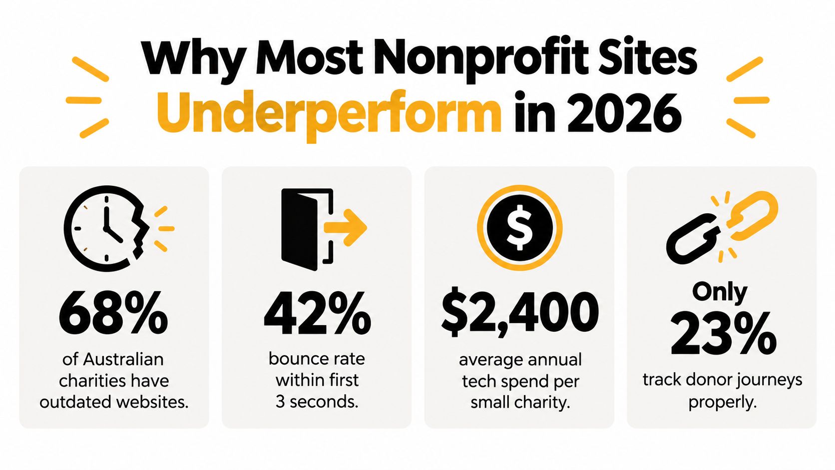
The sector data shows a gap between presence and accountability. More than 92% of Australian nonprofit organisations have a website, and 81% use social media, according to the 2023 Digital Technology in the Not-for-Profit Sector report. A website therefore operates within a wider ecosystem of search, social platforms, email, fundraising software, events, and personal referrals. Its job is to connect those channels to a clear next action.
The measurement gap creates a management problem. Only 39% of surveyed organisations regularly tracked and reported online performance to their boards, while roughly one in five wanted to measure performance but did not know where to begin, according to the same report. Without conversion tracking, a team can see visits without knowing whether a campaign produced a donation, enquiry, volunteer registration, service request, or newsletter subscription.
Start with outcomes, not page templates
Before selecting colours, a CMS, or a homepage layout, define what the website must help people complete:
- Donations: completed one-off and recurring gifts, with reliable receipts and transaction records.
- Enquiries: calls, emails, contact form submissions, and information requests.
- Volunteer registrations: completed applications that staff can follow up without re-entering details.
- Service access: beneficiaries finding eligibility information, referral pathways, opening hours, and offline contact options.
- Retention: newsletter subscriptions, campaign updates, event registrations, and repeat engagement.
Each outcome needs a primary call to action, a named analytics event, and an owner responsible for reviewing the result. A donation button is not successful only because it appears near the top of a page. It works when a person can find it, understand the request, complete the form, receive confirmation, and enter an appropriate follow-up journey.
Practical rule: If the team cannot name the action a page should support, the page is not ready to design.
Small and medium organisations also need to account for limited internal capacity. Only one in five small-to-medium nonprofits reported having an IT plan and budget for the next 12 months, compared with 33% of large and 56% of very large organisations, according to the same sector research. Maintainability is therefore part of nonprofit website design. A technically impressive site that staff cannot update, measure, or secure will create ongoing risk rather than lasting value.
Mapping Donor and Beneficiary Journeys That Actually Convert
Donors and beneficiaries may visit the same website, but they don't arrive with the same questions. A donor may ask whether the organisation is credible and what a contribution enables. A person seeking help may need an answer quickly, privately, and without being pushed through a fundraising narrative.
Treating both audiences as one journey creates avoidable friction. Map each journey through awareness, consideration, conversion, and retention, then assign each page a primary role.

Awareness and consideration
At the awareness stage, a visitor may arrive from a search result, social post, email, referral, or event. The page must answer who you help, what problem you address, and where you operate without forcing the visitor to decode sector language.
During consideration, people look for evidence. Donors need clear impact information, governance details, privacy explanations, and a straightforward description of how giving works. Beneficiaries need eligibility, locations, opening times, accessibility information, and an obvious route to a person or service.
Use different content paths instead of placing every audience in the same hero section. A homepage might offer two prominent choices, such as “I want to help” and “I need support”, then route each visitor to relevant information.
Conversion and retention
Conversion means more than a completed donation. It could be a volunteer application, a referral enquiry, an email subscription, or a service contact. Define the event before building the form, because the measurement requirement affects the form fields, confirmation page, CRM integration, and follow-up email.
Retention begins immediately after the action. A donor needs a clear receipt and a meaningful thank-you. A volunteer needs next steps. A beneficiary needs confirmation of what happens next and an alternative contact method if the digital process fails.
Teams that need a deeper framework for track donors across their journey can use donor journey mapping to connect first contact, giving behaviour, communication consent, and repeat engagement.
A practical page-planning template looks like this:
| Page | Primary audience | Journey stage | Primary KPI | Main action |
|---|---|---|---|---|
| Homepage | Mixed audiences | Awareness | Path selection | Choose a pathway |
| Program page | Beneficiaries and donors | Consideration | Engaged visits or enquiries | Learn about the service |
| Donate page | Donors | Conversion | Completed gifts | Donate |
| Volunteer page | Volunteers | Conversion | Completed applications | Apply |
| Impact page | Donors and funders | Consideration | Return visits or donation starts | Explore evidence |
| Contact page | All audiences | Conversion | Calls, emails, forms | Contact the organisation |
Review the map with staff and, where possible, people who use the service. Internal teams often know the organisation's terminology too well to notice where a first-time visitor gets lost.
The Essential Page Stack and What to Cut
A small charity doesn't need a large site to communicate credibility. It needs a focused page stack that the team can maintain and measure. Every page should answer a real visitor question and support one primary action.
The homepage should explain the mission, audience, location, and immediate options. It shouldn't try to contain every campaign, report, staff biography, and event. The About and impact content can establish history, governance, evidence, and accountability, but it should be organised around what supporters and service users need to know.
Decide what earns a place
| Page | It earns its place when | Keep | Cut or consolidate |
|---|---|---|---|
| Home | Most visitors need orientation | Mission, audience, pathways, key CTA | Repeated announcements and long introductions |
| Programs | Services are central to access | Eligibility, locations, process, contact route | Internal program language |
| Donate | Giving funds the work | Impact context, form, receipts, privacy | Multiple confusing donation destinations |
| Get involved | Volunteers or advocates matter | Clear opportunities and application process | Generic calls to “join us” |
| Contact | People need direct help | Phone, email, location, hours, form | A form with no response expectation |
| Impact | Evidence affects trust | Outcomes, stories, reporting, governance | Reports buried as document-only downloads |
| News and stories | Updates are maintained consistently | Recent, useful stories with clear dates | A neglected blog with old posts |
Pages often get added because an organisation assumes they're expected. Events, campaigns, resources, team profiles, and separate giving pages can be useful, but only when someone owns the content and the page has a measurable role.
Cut pages that create maintenance debt. Keep content that helps someone decide, act, or access a service.
Build the smallest useful version
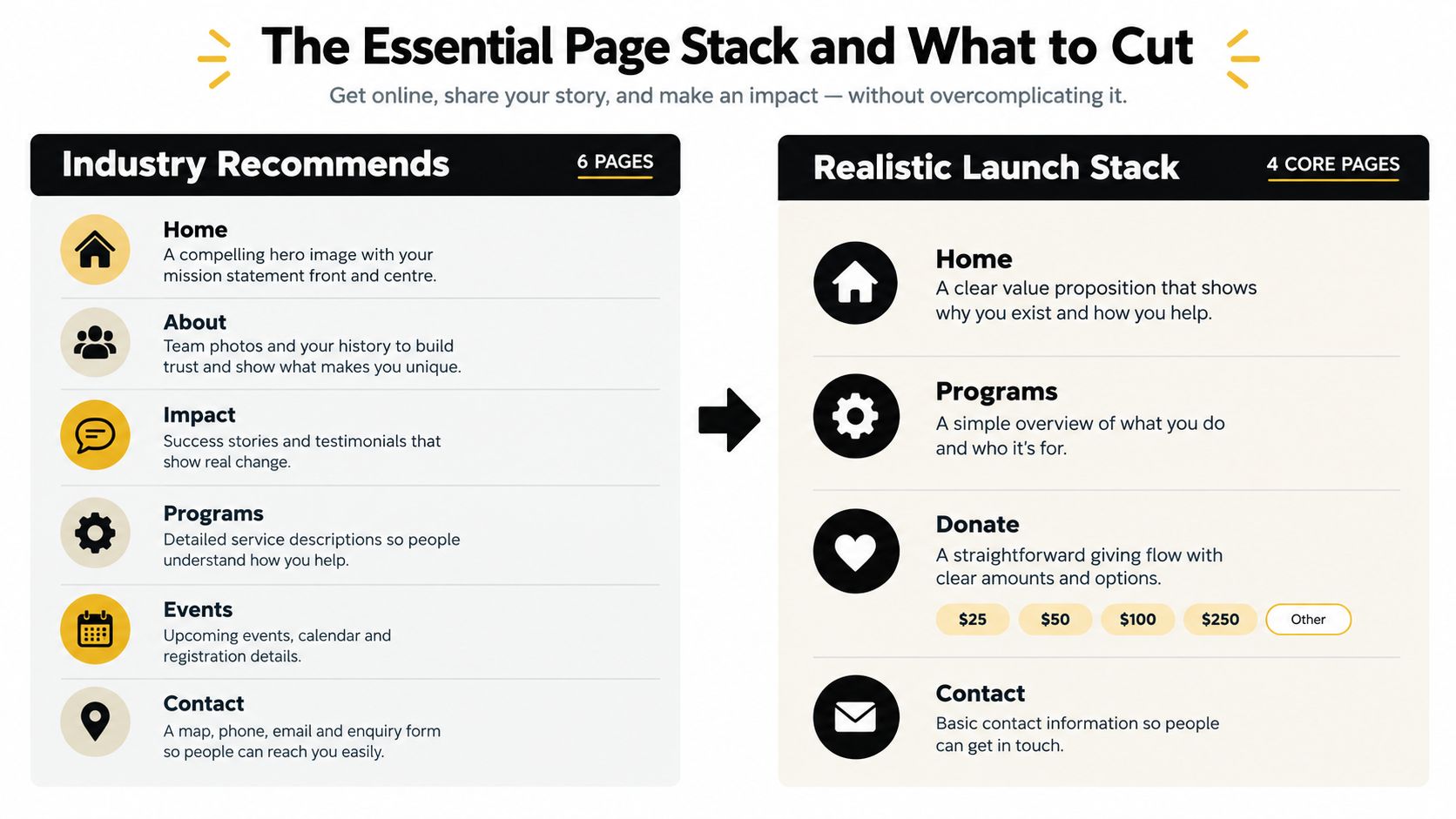
A realistic launch stack may contain Home, Programs, Donate, and Contact, with impact and volunteer content incorporated where it helps the main journeys. That doesn't mean the organisation should hide important information. It means content should be grouped around tasks rather than split into thin pages.
A useful test is simple. Ask whether the page has a distinct audience, a distinct search or navigation need, a responsible editor, and a distinct call to action. If the answer is no, consolidate it.
The same principle applies to WordPress development and WordPress design. A flexible CMS can support custom program directories, accessible forms, event registrations, and Gutenberg content blocks, but flexibility isn't a reason to add complexity. A capable WordPress developer should help the charity decide what to leave out, not merely build every requested page.
Designing the Donation Flow So People Actually Finish Giving
A donation form is a checkout, not a decorative feature. Every extra decision, field, redirect, or unclear error message gives a motivated donor another reason to stop.
Start with the visible path. Place a clear donate action in the main navigation, repeat it at relevant points in impact stories and program pages, and keep the label specific. “Donate” is usually clearer than a vague label such as “Support us”, especially for screen-reader users and visitors scanning quickly.
Remove hesitation from the form
Australian charities should choose a payment provider that supports their operating model, receipt requirements, recurring gifts, reconciliation, and privacy obligations. A fundraising platform may reduce technical overhead, while a more configurable payment setup can provide greater control over the experience. A useful comparison of fundraising software options can help teams create a shortlist before committing.
Keep the first screen focused on the actual decision:
- Choose the gift type: Make one-off and recurring giving visible without making either option confusing.
- Choose an amount: Offer sensible suggested amounts with a custom option, and explain impact without promising an outcome the organisation can't substantiate.
- Enter details: Request only information needed for payment, receipt, consent, and follow-up.
- Review and submit: Show the total, frequency, recipient, and privacy information before payment.
- Confirm: Provide an on-screen thank-you, receipt expectation, contact details, and the next step.
A three-step form that asks for an amount, then personal details, then payment can often be simplified into one responsive screen with clear sections. The donor still sees recurring giving, but doesn't have to wait through a series of page loads to understand the full commitment.
The form needs proper labels, keyboard access, visible focus, readable contrast, autocomplete support, and error messages that explain what to fix. Never clear every field after one mistake. Preserve valid entries and move focus to the problem so the user can recover.
Make trust visible at the moment of payment
Show the organisation's legal identity, ABN where appropriate, privacy link, payment provider information, and a direct contact method. Don't rely on a small padlock graphic as the entire trust strategy. Donors want to know who receives the money, how recurring gifts can be changed or cancelled, and what happens to their details.
The confirmation page is part of the donation experience. It should confirm success without exposing sensitive payment data, explain when a receipt will arrive, and offer an optional next action such as reading an impact update or joining an email list with explicit consent.
Test the flow on a real phone, with keyboard navigation, with validation errors, and with a slow connection. A form that works in a desktop browser but fails after a payment redirect isn't finished.
Accessibility and Low-Bandwidth Performance as Conversion Requirements
Accessibility isn't a compliance ornament placed on a site after the design is complete. If someone can't read a page, operate a form, understand an error, or load the essential information, they can't donate or access a service.
The digital exclusion challenge makes this especially important. One in four Australians, approximately 6.4 million people, are digitally excluded, and 46% say rising living costs have affected their ability to get online, according to the Good360 Digital Access Report. A visually ambitious website can fail the people it exists to serve when it depends on large video files, document-only information, complex forms, or account creation.
Design for constrained access
Use plain-language summaries before detailed material. Publish essential information as accessible HTML instead of hiding it inside PDFs. Provide a prominent phone number and practical offline alternative for people who can't complete a digital process. Compress images, avoid autoplay media, and remove scripts that don't support the user's task.
The Australian Government accessibility benchmark is WCAG Level AA, and the Australian Charities and Not-for-profits Commission accessibility guidance states that its website aims to meet WCAG 2.0 at AA level. For a nonprofit, that benchmark should apply to every high-value path, including donations, contact, volunteer applications, event registration, and service enquiries.
Core controls include:
- Semantic structure: Use meaningful headings, landmarks, lists, and labels.
- Keyboard operation: Ensure menus, modals, date pickers, payment fields, and forms work without a mouse.
- Text alternatives: Describe meaningful images and leave decorative images empty for assistive technology.
- Readable presentation: Maintain sufficient colour contrast, scalable text, and visible focus states.
- Multimedia access: Add captions or transcripts to videos and audio.
- Error recovery: Identify the field, describe the problem, and preserve the user's completed information.
Automated scans can identify missing labels, contrast issues, and heading errors, but they can't judge whether a service explanation makes sense. Combine automated checks with keyboard testing and screen-reader review. Repeat testing after CMS, plugin, payment, or content changes.
Performance needs the same discipline. The ACCC's Measuring Broadband Australia research found that access speed and provider selection didn't materially determine website browsing performance. That points developers towards page construction, including image sizing, JavaScript execution, caching, third-party scripts, and layout stability.
Choosing a CMS, Hosting, and Security Stack Small Nonprofits Can Maintain
The right CMS is the one the organisation can update safely. WordPress offers ownership, a broad development ecosystem, custom post types, Gutenberg blocks, donation integrations, and control over content structure. It also introduces plugin, update, user-permission, and hosting responsibilities.
Managed nonprofit builders reduce technical maintenance and may provide fundraising features out of the box. The trade-off is often less control over data, templates, integrations, and long-term migration. Neither option is automatically better. The decision depends on staff capability, content complexity, donor data requirements, and who will handle maintenance when something breaks.
Choose by operating reality
Infoxchange's 2025 digital technology report describes smaller charities that may operate with only a laptop, spreadsheet, and outdated website. That reality should shape the recommendation. A charity without technical capacity may be safer with managed updates and a clear support arrangement than with a heavily customised WordPress installation that no one monitors.
A practical rubric:
| Requirement | Managed platform | WordPress |
|---|---|---|
| Low technical workload | Strong fit | Requires maintenance plan |
| Custom content structures | May be limited | Highly configurable |
| Plugin risk | Usually lower | Must be actively controlled |
| Data and migration control | Check contract carefully | Greater ownership |
| Gutenberg block editing | Platform-dependent | Native option |
| Complex integrations | May require vendor support | Broad development options |
If WordPress is appropriate, use a limited plugin set, a reputable host, automated backups, SSL, staged updates, least-privilege accounts, and a documented recovery process. Don't give every contributor administrator access. Separate content editing from configuration and payment management.
Create a maintenance calendar
Weekly: Review donation and contact forms, check critical notifications, and look for failed integrations.
Monthly: Apply updates through a controlled process, verify backups, review analytics events, and inspect Search Console for indexing problems.
Quarterly: Run accessibility checks, keyboard-test conversion paths, review user permissions, test restore procedures, and remove unused plugins or accounts.
After every major change: Test forms, payment redirects, tracking, mobile layouts, confirmation pages, and key links.
Organisations comparing platforms beyond WordPress can use HolyJot's church website platform guide as a useful reference for evaluating content editing, registrations, forms, and organisational needs.
Security also includes communication. Publish a clear privacy notice, explain payment processing, minimise data collection, obtain explicit consent for marketing, and provide a visible contact route for suspected incidents. Trust grows when the organisation explains its processes in plain language.
SEO, Analytics, and Reporting That Boards and Funders Understand
A board doesn't need a dashboard full of disconnected charts. It needs a concise view of whether the website is helping the organisation achieve its mission.
Start with Google Search Console. Verify ownership, submit the sitemap, review indexing, and identify the searches that lead people to program, support, donation, and volunteer pages. Write page titles and descriptions around the language real audiences use, including location and service terms where relevant.
Google Analytics 4 should remain lean. Configure meaningful key events such as:
- Donate: A completed donation or a confirmed handoff to the payment provider.
- Enquiry: A completed contact or service request.
- Volunteer application: A completed registration.
- Email sign-up: A consented subscription.
- Service access: A meaningful interaction, such as selecting a referral pathway or downloading an accessible resource.
Use a consistent UTM convention for campaigns. Record source, medium, campaign, and content in a shared document so staff can interpret results months later. Avoid tagging internal links, because that can overwrite the original acquisition source.
Build a one-page monthly report
A useful report connects activity to decisions:
| Reporting area | Question it answers |
|---|---|
| Organic visibility | Are people finding relevant services and programs? |
| Conversion events | Are visitors completing the actions that matter? |
| Donation performance | Are visitors starting and completing gifts? |
| Traffic sources | Which channels send engaged audiences? |
| Technical health | Are errors, slow pages, or broken forms blocking action? |
| Next priority | What should the team change or test next? |
The exact reporting fields should reflect the organisation's goals. A service charity may care more about qualified enquiries than donation starts. A volunteer-led organisation may prioritise completed applications and response times.
Review trends alongside campaign dates, content changes, and operational capacity. If enquiries rise but the team can't respond promptly, the website may be generating demand without supporting service delivery. Measurement only becomes useful when someone can act on it.
Timeline, Budget, and Pre-Launch Checklist for 2026
A nonprofit website project should be phased around decisions, not vague promises of a launch date. Begin with discovery and content inventory, then agree on the audience journeys, page stack, measurement plan, and technical responsibilities before visual design starts.
A focused refresh can improve messaging, accessibility, donation flow, and analytics without replacing the whole site. A broader rebuild may be justified when the CMS, hosting, information architecture, or integrations prevent the organisation from serving people effectively. A custom build offers more control, but it also creates more ownership and maintenance responsibility.
A practical project sequence
- Discovery: Audit the current site, interview staff, review analytics, and define outcomes.
- Structure: Map donor and beneficiary journeys, agree on the page stack, and assign content owners.
- Design: Create accessible wireframes and responsive interface designs around primary actions.
- Build: Implement the CMS, forms, donation integration, analytics, SEO foundations, and security controls.
- Content and testing: Rewrite key pages, optimise media, test keyboard and screen-reader use, and validate forms.
- Launch: Confirm redirects, backups, SSL, analytics events, legal pages, 404 handling, and staff access.
- Optimisation: Review real behaviour during the first 90 days and prioritise fixes based on evidence.
Before launch, test every donation and contact path on representative mobile devices. Confirm that recurring giving, receipts, confirmation emails, consent records, form errors, and analytics events work as intended. Check that headings, link text, contrast, focus states, captions, image alternatives, and HTML content meet the chosen accessibility standard.
The most common launch mistakes are avoidable: publishing without a content owner, leaving old URLs unredirected, failing to test payment redirects, installing unnecessary plugins, forgetting backups, and treating analytics as a later task.
For organisations that need a broader digital capability, WordPress development can support custom Gutenberg blocks, structured program content, accessible templates, and maintainable editing workflows. Shopify development and Shopify design make more sense for an ecommerce fundraising model or a store that supports the mission, while integrations should be selected around data ownership, consent, and reporting rather than novelty. Teams can also connect Google Tag Manager and Google Analytics, configure Meta Pixel and Conversions API where relevant, and use Google Ads or Meta campaigns to direct traffic into measured landing pages.
Alpha Omega Digital works with organisations on website design, WordPress development, Shopify development, analytics setup, and paid advertising. The team is based in Melbourne and also services clients from Sydney, Brisbane, Newcastle, Perth, Adelaide, Darwin, and Hobart.
If your business has a paid ads budget of at least $3,000 a month, Alpha Omega Digital offers a low-risk opportunity to receive one month of paid ads management free, with the campaign built around measurable conversion paths and clear reporting. Visit Alpha Omega Digital to discuss your website, tracking, and growth requirements.
[email protected]
Read more insights from our team on web design, paid ads, and growth strategy.