You don't really get judged on a service website at 11pm by its colours. You get judged on whether it gives a tired homeowner a phone number, a booking path, or a reason to trust you before they close the tab. That's why I look at service business website examples as conversion systems, not as pretty homepages.
A burst pipe, a dead power point, or a last-minute cleaning job puts the visitor into a narrow mode. They want fast answers, not brand poetry. They scan for proof, pricing hints, guarantees, and the shortest route to a real person. That same behaviour shows up across trades, cleaning, handyman work, and multi-service businesses, which is why the best service sites all make the next step obvious.
I work with Melbourne businesses that need sites to do a job, not just look finished. The strongest pages usually share the same bones, clear headline, visible trust signals, and a call to action that doesn't make people think too hard. If you're comparing WordPress development, WordPress Design, Shopify development, Shopify design, or a broader marketing agency melbourne option, the lesson is the same. The site has to move someone from interest to action quickly.
There's also a practical reason service sites matter so much in Australia. The old gap between internet access and website adoption was real, especially for smaller firms. An ACMA report found that 94% of SMEs had internet access in May 2013, while only 64% had a website, and that gap was larger for small businesses than medium businesses ACMA report on Australian SMEs in the digital economy. That's the reason I still think a lot of trades and local service firms are underusing the web. They're online, but they're not using the site as a lead engine.
The best examples also line up with how Australian buyers now behave. ABS online retail sales hit $4,411.2 million in December 2024, and that was 12.7% higher than December 2023 ABS retail trade release for January 2024. That's retail data, not service data, but it shows the scale of digital buying behaviour. If people will buy food and non-food online at that level, they'll also expect service sites to make enquiry, booking, or quote requests feel simple.
For anyone looking for seo agency melbourne, Google ads, GTM and google analytics, or Google my business support, the same logic applies. A service site should not just describe what you do. It should help the visitor choose the right path, and it should do that fast. I'm going to walk through seven live examples the way I would in a client meeting, with a focus on what the homepage makes people do next.
SyncThemCalendars for freelancers
1. Alpha Omega Digital
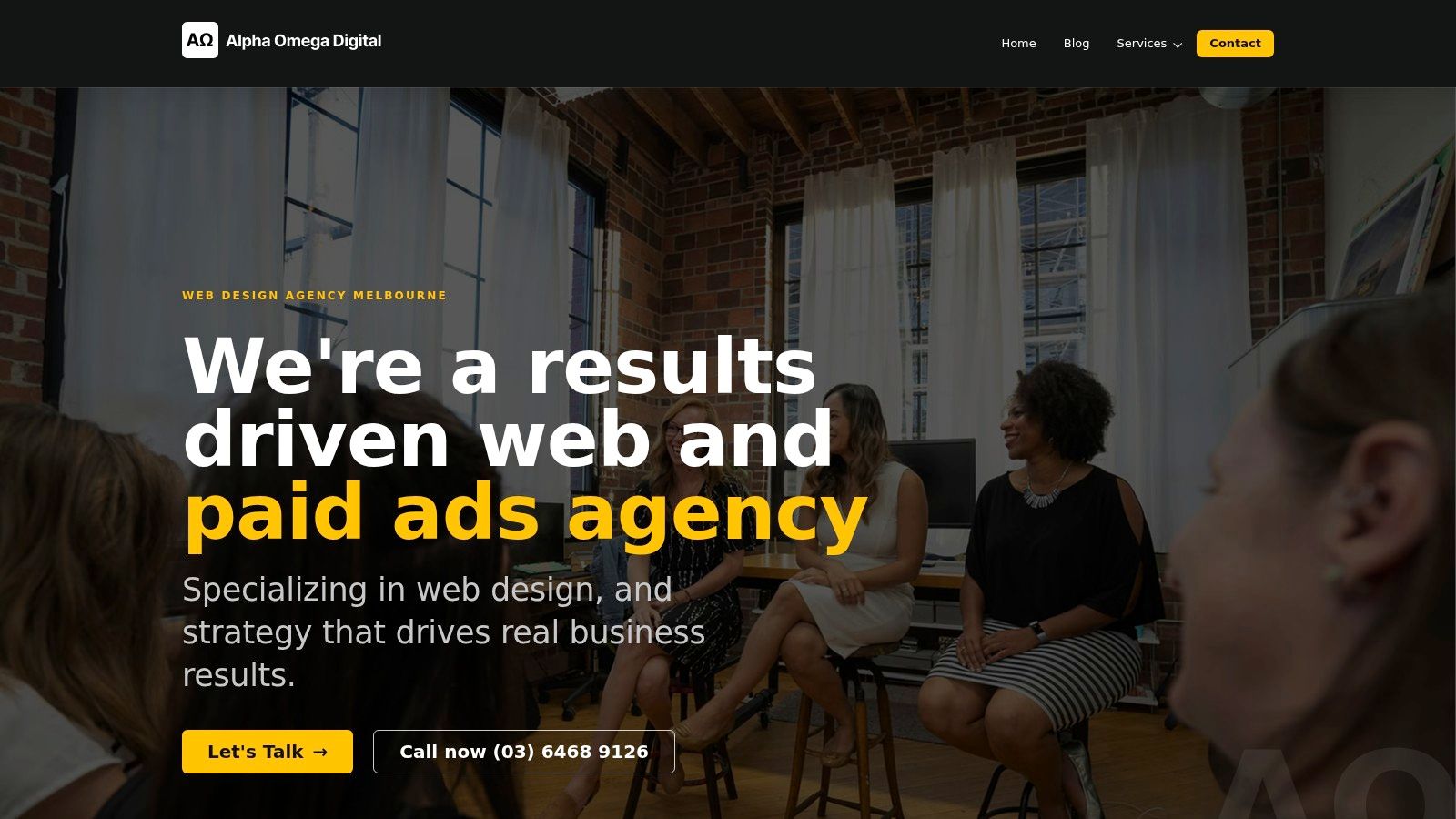
Alpha Omega Digital is the easiest example to start with because it shows the whole system, not just the front end. The site doesn't try to win with decoration alone. It feels like a digital marketing agency melbourne built around the simple question every service business asks, “How does this page turn a visitor into a lead?”
Why the homepage works
The headline work is direct. It reads like a promise, not a slogan. That matters for service business website examples because most visitors are not browsing for art direction, they're deciding whether to click, call, or scroll.
The proof sits close to the action. The site highlights client feedback and measurable outcomes, which is exactly what a buyer wants to see before they invest in WordPress development company support, Shopify developers, or a Google ads agency relationship. It feels like the agency understands that trust is earned near the click, not somewhere far below the fold.
Practical rule: If your homepage can't explain what happens after the lead comes in, the design is incomplete.
The conversion system behind it
What stands out most is the way the page seems built to support a full path from traffic to enquiry. That's useful for service businesses because a home page often has to serve different visitors at once, a plumber, a retailer, a clinic, or a founder comparing Facebook ads agency options. The page still keeps the journey narrow enough that people don't get lost.
The offer also feels broad enough to support different buyer types without becoming vague. That's a hard balance. If you're selling WordPress development, WordPress Design, Shopify development, or Shopify design, the homepage needs to signal capability without turning into a laundry list. This site does that by keeping the positioning focused on outcomes, not just deliverables.
The strongest service sites usually do three things at once, and this one does them well.
- Show the business type clearly: People should know within seconds whether you work with ecommerce, service businesses, or both.
- Make the proof visible early: Reviews, results, and process beats vague claims every time.
- Reduce decision friction: A visitor should know where to click if they want a quote, a call, or more detail.
Platform choices that make sense
For agencies and service businesses with growth goals, I like seeing a stack that can support custom work and performance marketing together. A site like this is the kind of project where GTM and google analytics matter, because the page is only useful if enquiry behaviour is being measured properly. It's also the kind of business where Setting up Meta conversion APi and clean ad tracking become important, since leads don't come from one channel anymore.
That's where the practical trade-off shows up. A pretty site without tracking is just presentation. A site built with conversion in mind can support Meta ads creative testing process, How to measure success facebook ads, and downstream lead handling. The website becomes part of the sales system, not a separate brochure.
For a Melbourne business owner comparing wordpress-development-melbourne, wordpress-web-developer, or wordpress-website-developer support, this is the model I'd point to. It's not the cheapest kind of build, and it's not trying to be. It's designed to support measurable work, which is what most serious service businesses need.
Where it wins and where it doesn't
The win is obvious. It feels credible, structured, and commercially serious. That makes it a strong reference point for anyone wanting WordPress development Melbourne or Shopify development partners who understand the difference between a live site and a lead machine.
The limitation is also clear. A site like this is usually quote-based and discovery-led, so there isn't instant pricing. That can slow some buyers down, especially if they're comparing vendors fast. But for higher-value work, especially for ecommerce and lead generation, the absence of public pricing often signals a more customized process.
If I were briefing a client on a wordpress-development project or a Shopify-developer-api integration, I'd use this site as the benchmark for the structure, the trust signals, and the conversion logic. It's built like a serious service site, which is exactly what most agencies should be aiming for.
2. Maid to Clean
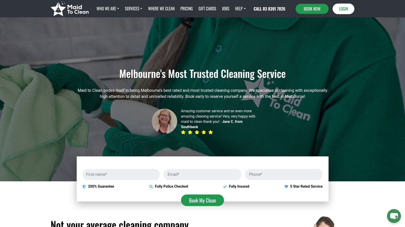
Maid to Clean shows how strong service websites can be when they remove hesitation early. The page is built around clear pricing, fast booking, and enough reassurance to make a visitor move without calling around. For a local service, that's the right job.
The headline does the heavy lifting
The homepage doesn't waste time pretending everyone wants a story. It tells the visitor what the service is, how booking works, and why it's safe to proceed. That matters in cleaning because the buyer is often comparing multiple providers while juggling time pressure.
The pricing language is especially useful. When a site gives a “from” price or an instant quote path, it lowers the friction that kills enquiry rates. It also sets a clearer expectation than a vague “contact us for details” approach. In service work, clarity often beats creativity.
This is also where a lot of service business website examples fall short. They look polished but don't answer the practical questions. Maid to Clean does the opposite. It gives the visitor a reason to trust the process and a way to book without chasing someone down.
Trust signals are placed where they matter
The homepage uses reassurance well. Guarantees, insurance, and social proof sit close to the booking decision, which is exactly where they belong. If you're building Google ads for service based businesses, this is the same logic you want on the landing page. The ad brought the visitor in. The page has to close the gap.
The booking flow is also mobile-friendly, which matters because service buyers often arrive from search on their phone. For businesses working on Google ads for contact form submissions, the lesson is simple, make the first conversion step small. If you ask for too much upfront, people disappear.
A service page works better when it behaves like a good receptionist. It answers the obvious questions first and doesn't create more work for the customer.
Why it's a strong model for local operators
This site is a useful example for cleaners, but also for any local business that can quote quickly. I'd borrow the structure for a marketing agency melbourne campaign landing page, a salon booking page, or a mobile service site. The principle is the same, reduce the distance between intent and action.
The trade-off is that the site leans into a clearer service area. That's fine if your business is geographically focused. It's less useful if you're trying to attract a national audience. But for Melbourne operators, local clarity is often a strength, not a weakness.
If I were advising on Local Seo, Google my business, and booking-focused pages, I'd tell the client to keep this model in mind. The page should show the offer, the price logic, and the booking route without distraction. For a service business, that's often enough to beat a prettier competitor.
What service owners should copy
The most copyable part is the straight path from landing to booking. It's not overloaded with side quests. That matters more than people admit.
- Show the price logic early: Even if you can't show an exact price, explain how pricing works.
- Keep the booking path short: Fewer fields usually means more completed forms.
- Place proof near the action: Reviews and guarantees should sit beside the CTA, not buried in a footer.
- Design for phones first: Many service enquiries happen on mobile, so the page has to feel easy there.
For anyone planning WordPress development or Shopify design around a service business, this is a reminder that clean conversion structure is not a nice-to-have. It is the site.
3. Fix-It Right Plumbing
Fix-It Right Plumbing is a strong example of a site that earns trust through detail. It doesn't just say “we fix plumbing problems.” It shows the visitor how the business works, what kind of guarantees are attached, and why the customer should feel safe calling.
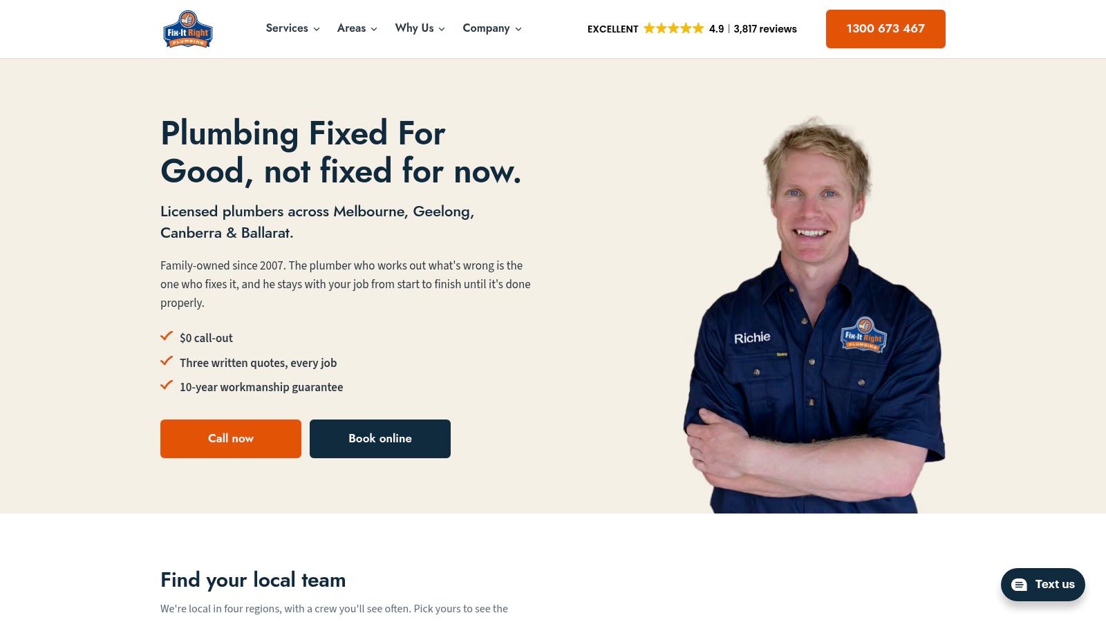
Trust is the main design asset
For plumbing, trust does a lot of the conversion work. The visitor is usually worried about cost, quality, and whether they'll be upsold on the spot. This site handles that by foregrounding process and reassurance rather than hiding them behind generic hero copy.
I like this kind of page for trades because it treats the website like a quoting assistant. The customer can see that the business is licensed, structured, and willing to explain itself. That's especially valuable in high-stakes service categories where the user needs a quick confidence boost before calling.
The site also makes room for education-led content. That matters because people often arrive with a symptom, not a diagnosis. When a plumbing site explains likely causes and possible fixes in plain language, it reduces fear and makes the visitor more willing to engage.
The content supports the sales conversation
This is one of the better patterns for PPC for tradies. The homepage and service pages are doing some of the pre-sale work that would otherwise fall on the phone call. For Google ads, that's a huge advantage. The landing page doesn't have to invent trust from scratch, it can extend it.
A lot of agencies sell ad traffic as if it were the whole game. It isn't. You still need the page to answer the visitor's practical objections. That's why I often recommend service businesses think about the whole funnel together, especially if they're spending on Google ads for plumbers or trying to improve Google ads shopping style lead paths for a local trade.
The page structure also makes room for local SEO signals. That helps businesses that want to rank for suburb or service-area terms without duplicating the same bland content across every page. It's a better approach than stuffing city names into copy and hoping it works.
What works and what doesn't
What works is the combination of clarity and confidence. The site doesn't feel flashy, but it feels dependable. For a plumber, that's often more persuasive than a glossy design.
The downside is that there's no instant public price list. Some users want that. But plumbing usually needs diagnosis, so a quote-led model is understandable. The trick is making sure the quote process itself feels fair and structured, which this site does well.
Practical rule: If the service is technical, the website should make the process feel simple, not dumbed down.
For a Melbourne agency owner, this is a useful benchmark for WordPress development company projects aimed at trades. A custom build can support detailed service pages, local landing pages, and clear calls to action without feeling cluttered. It's also the kind of site where Building custom blocks in Gutenberg can be useful, because service teams often need reusable content sections for trust, FAQs, and case-study style explanations.
4. Service Today
Service Today is a good example of how a multi-trade brand can keep the conversion path tight without making the site feel chaotic. It has to speak to plumbing, electrical, HVAC, security, garage doors, and bathrooms, which is a lot of territory. The site manages that by keeping the booking journey simple and the service categories easy to scan.
The structure suits urgent jobs
Urgent service businesses need confidence and speed. This site leans into both. The messaging is clear that the company can handle same-day jobs, and the booking experience guides the visitor rather than asking them to figure it out alone.
That's useful for anyone comparing Google ads for service based businesses landing pages. If the ad is about speed, the page needs to feel fast. If the business handles urgent callouts, the site should make the next step obvious from the first screen.
The other reason this site works is that it handles multiple verticals without feeling like a directory. That's not easy. The navigation still points people into the right category, so the user can self-select quickly. That's the kind of information architecture I'd want on a multi-service WordPress build.
Multi-service sites need stronger routing
A brand like this has to answer a different question than a single-trade specialist. It's not just “Do you fix this?” It's “Which team should I choose, and what happens next?” The site answers that with clear pathways and a strong headline promise.
For service businesses thinking about WordPress development or Shopify development as part of a broader lead engine, this is a useful model. The home page is not the final answer. It's the traffic router. Once the user chooses the category, the service page can handle the detail.
That's also why I like seeing strong FAQ content on sites like this. It's not filler. It helps with search intent, objection handling, and call deflection. If the same questions keep landing in your inbox, they belong on the page.
Trade-offs worth accepting
The biggest trade-off is pricing opacity. Like many urgent-service businesses, the site doesn't publish exact prices for every job. Some customers want instant numbers, but the nature of the work often makes that unrealistic.
The upside is that the site can keep the service conversation controlled. That matters for quality lead handling, especially if the business is running paid traffic and wants to protect margin. For a Facebook ads agency client, I'd often suggest a landing page pattern like this, one service category per page, one main CTA, no clutter.
It's also a useful reference point for businesses that need to coordinate search, forms, and call handling. If you're investing in GTM and google analytics, this is the sort of site where event tracking should be mapped carefully. You want to know which trade category, which CTA, and which device drives enquiries.
5. The Local Electrician
The Local Electrician stands out because it leads with specialisation. That's smart. In a crowded trade market, the fastest way to look credible is often to show a clear niche and a clear service area. This site does both.
Specialisation beats generic trade copy
A lot of electrician websites say the same thing. This one doesn't. It signals regulated capability early, which gives the buyer a reason to keep reading. That matters when the job is technical or time-sensitive, because the visitor is asking, “Can this company handle my problem?”
The site also uses emergency availability well. That combination of niche plus urgency is powerful. It's the same principle I'd use for Google ads for plumbers or PPC for tradies more broadly, the ad and the landing page should both reflect the actual job type the customer is trying to solve.
The website feels built for trust first, then action. That's the right order for electrical work. It also means the content can carry some of the load that a phone call would otherwise need to carry.
The FAQ depth helps both SEO and conversion
This is one of those sites where the FAQ section earns its place. It answers the questions customers are already wondering about. That helps conversion because the buyer doesn't need to chase extra information before contacting the business.
For local service businesses, this matters a lot. A detailed site can support Local Seo, suburb pages, and service intent without sounding stuffed with keywords. It also gives the business a place to explain why a job needs a callout, what happens during inspection, and what the customer can expect next.
That's useful if you're planning a broader seo agency melbourne strategy for a trade client. The content isn't there to look busy. It's there to reduce friction and improve the quality of inbound leads.
What a Melbourne agency can learn from it
The strongest part of the site is its discipline. It doesn't try to be everything to everyone. That's a lesson many agencies should take to heart when they build wordpress-development-melbourne or wordpress-developers pages for service clients.
A site can still rank and convert without being broad. In fact, broad sites often convert worse because they hide the service. If a business is a specialist, the homepage should say so.
For businesses exploring How much does it cost to start google ads, this site is a reminder that ad spend only works if the page is aligned with the search intent. Urgent electrical traffic should land on an urgent electrical page. It sounds obvious, but it's where many campaigns leak.
6. Hire A Hubby
Hire A Hubby is a good example of how a franchise-style business can turn a large network into a usable website. It has to support local discovery, commercial jobs, and separate pathways for different customer types. That requires better routing than a standard single-trade site.
The location model is the point
The key idea here is location matching. Visitors need to know quickly which local operator serves them. That makes the site useful for both search and conversion, because it connects the national brand to a local human being.
That structure is also helpful for businesses that are thinking about WordPress development company architecture across multiple regions. If you're running different city pages for Melbourne, Sydney, Brisbane, Newcastle, Perth, Adelaide, Darwin, and Hobart, the site needs to avoid duplication and keep the user moving toward the right local contact path.
The site's segmented service pathways also make sense. Residential, commercial, and aged care all have different buying motives, and the page respects that. I like that because it keeps the messaging practical instead of generic.
Franchise logic changes the website job
For a single owner-operator, the website is mostly a lead catcher. For a franchise network, it also becomes a routing system and a recruitment tool. Hire A Hubby folds that into the main site, which is smart. It recognises that not every visitor is a customer.
That's a useful lesson for any business exploring Building custom blocks in Gutenberg or WordPress development at scale. The page modules need to support different journeys without becoming messy. You want repeated patterns, not repeated confusion.
It also shows why multi-location SEO needs discipline. A generic city page won't do much if it doesn't connect the visitor to a real local operator. This site avoids that trap by making the local path visible.
The trade-offs are real
There's a downside to this kind of structure. Quality can vary across franchisees, so the brand has to rely on the local operator experience as much as the central site. That's not a design flaw, it's a business model reality.
But the conversion framework is still strong. Repeated quote CTAs, location discovery, and clear service segmentation make it easy for the user to take the next step. That's what most service sites should aim for, even if they're much smaller.
If you're comparing WordPress development melbourne options for a franchise, this site is a reminder that the homepage needs to be a dispatcher, not a brochure. It should help each visitor find the right branch, the right job type, and the right action.
7. Fantastic Services Australia
Fantastic Services Australia takes a marketplace-like approach but keeps a single accountable brand at the centre. That's attractive for buyers who want convenience without losing a clear point of contact. The site turns a big service catalogue into something the visitor can still move through with ease.
Convenience is the selling point
The site makes booking and management feel easy. That matters in home services because repeat customers don't want to re-explain themselves every time. The app and membership model strengthen that idea by giving people a reason to come back.
This is a useful pattern for businesses that want to think beyond first-click conversion. A lot of service sites obsess over the first enquiry and ignore retention. If you're building for ecommerce as well as services, or mixing service bookings with add-on products, this kind of structure can be very effective.
The homepage also positions the brand as an accountable alternative to a fragmented marketplace. That's strong copy. It answers a real objection, which is, “Who owns the job?” For a user comparing providers, that clarity matters.
Why it works for multi-service businesses
The page is broad, but it still feels controlled. That's the hard part. A lot of broad service websites become cluttered because they keep adding options without tightening the route. This one keeps the booking concept central, which stops the experience from drifting.
I'd use this model when advising on Shopify development or service-commerce hybrids. If a business sells products and services, the site has to make both paths feel connected. The user should know whether they're buying a task, a recurring service, or an add-on.
It's also a good reminder that design alone doesn't carry conversion. The promise, the routing, and the repeat-booking mechanism do a lot of the work. The page feels built for ongoing relationship value, not just one-off jobs.
What to take from it
If I were using this as a template for a Melbourne client, I'd borrow the clarity, not the complexity. The big lesson is that a broad service offer still needs a single, visible next step.
Keep the homepage focused on what the visitor wants to do next, not on how many things the business can do.
That applies whether you're building Shopify developers, shopify-development-partners, or a local service site with multiple categories. The more options you have, the more important the routing becomes.
For anyone comparing Google shopping ads not spending budget problems or PMAX VS google shopping ads strategy, the same conversion logic applies. If the traffic is expensive, the landing experience has to be clear, fast, and measurable. Confused users don't convert well, no matter how good the campaign setup is.
Top 7 Service Business Websites Comparison
| Provider | Implementation complexity | Resource requirements | Expected outcomes | Ideal use cases | Key advantages |
|---|---|---|---|---|---|
| Alpha Omega Digital | High, custom web + integrated ad and automation setup | Moderate–High: developers, designers, ad spend, analytics | Measurable growth and improved ROAS (client-reported 3x–5x) | SMBs, Shopify/WordPress stores, service professionals in Australia | End-to-end integration, performance-focused, strong reporting |
| Maid to Clean | Low, instant booking and pricing UI | Low: booking system, payment integration, local operations | Higher conversion rate via frictionless booking and trust signals | Local residential cleaning, mobile-first customers | Instant quotes/booking, transparent pricing, dense social proof |
| Fix-It Right Plumbing | Medium, trust architecture and education-led content | Medium: licensed trades, content creation, booking/finance setup | More qualified leads, reduced price sensitivity, higher trust | Residential plumbing in regional markets, warranty-focused clients | Strong guarantees/licenses, educational content, clear CTAs |
| Service Today | Medium–High, multi-service booking platform with guarantees | High: national operations, multi-trade teams, marketing scale | High volume urgent leads, cross-service conversions | National multi-trade lead generation, urgent/priority jobs | Same-day guarantee, guided booking, service-specific pathways |
| The Local Electrician | Low–Medium, focused specialty site with FAQs and CTAs | Medium: licensed specialists, 24/7 support, local SEO | Trust-driven emergency bookings and higher-value jobs | Regulated specialties (Level 2), emergency electrical work in Sydney | Regulated differentiation, emergency availability, detailed credentials |
| Hire A Hubby | Medium, franchise routing and multi-location lead flows | High: franchise network support, location finder, local marketing | Scalable local lead distribution and franchise growth | Multi-location franchise businesses, residential/commercial quotes | Local routing, clear quote CTAs, franchise-scalable template |
| Fantastic Services Australia | Medium–High, marketplace-style app/platform with membership | High: app/platform dev, vetted contractors, membership ops | Improved retention, repeat bookings, cross-sell opportunities | Customers wanting bundled home services and subscription benefits | Unified booking/app, membership retention program, broad service catalog |
Turning These Examples Into a Site That Gets the Call
If you take one thing from these examples, make it this. Every service site needs a clear next step, visible proof near it, and a fast route to a real person. That sounds simple, but most sites still miss at least one of those three things.
Start with the homepage. Check whether the phone number is visible without hunting. Check whether your pricing approach is explained in plain language. Check whether guarantees, licences, reviews, or years in business sit close to the main call to action. If any of those are buried, the page is working harder than it should.
I'd also make the site match the way the business sells. A plumber doesn't need the same booking flow as a salon. A consultant doesn't need the same proof stack as a handyman franchise. A Shopify brand doesn't need the same service journey as a local electrician. That's why the best service business website examples are useful; they show the shape of the conversion path, not just the visual style.
For ecommerce teams, the same thinking helps with Shopify design, Shopify development, and Shopify API work too. If the product page, the ad, and the checkout aren't aligned, the traffic leaks. For service businesses, the leak usually happens earlier, at the point where the visitor decides whether to call, book, or leave. Good pages reduce that leak.
The clearest pattern across the best sites is simple. They remove unnecessary doubt. They show the business is real. They make the next action obvious. That is why I keep pushing clients to think about pages as systems, not assets. A good homepage doesn't just present the business, it moves the buyer forward.
If you're updating a local service site, I'd recommend measuring calls, form fills, and bookings for two weeks after each change. Don't change five things at once. Move the headline first if it's weak. Then tighten the proof. Then simplify the CTA path. That slower process usually tells you more than a full redesign.
For Melbourne businesses wanting support with WordPress development, WordPress Design, Shopify development, Shopify design, Google Ads, or a broader digital marketing agency melbourne strategy, the goal should be the same. Build a site that helps the right visitor take the next step without friction. If the site does that, the rest of the marketing gets much easier.
If you want a service website that does more than look polished, I can help with the build, the conversion logic, and the tracking behind it. Alpha Omega Digital designs WordPress and Shopify sites for service businesses and ecommerce brands, then connects them to ads, analytics, and lead handling that actually support growth. Visit Alpha Omega Digital and reach out if you want a site that turns more visitors into calls, bookings, and qualified enquiries.
[email protected]
Read more insights from our team on web design, paid ads, and growth strategy.